Closed Until It’s Over
Jessica Zimmer Interviewed by Joshua Jean-Marie
Earlier this year, we spoke with image-maker and dear friend, Richard Gary, to revisit the early stages of our partnership and learn more about what experiences shaped Rich’s journey as a photographer. Towards the end of our conversation, Rich left us inspired with the following thoughts on the importance of documenting where you are: “Everyone should take advantage of where they are, and every photographer should document where they are. Just because you’re there or it happens to be in your time, you think it may not be interesting, but I can guarantee you if you take a picture, then later you’ll find out it meant something.”
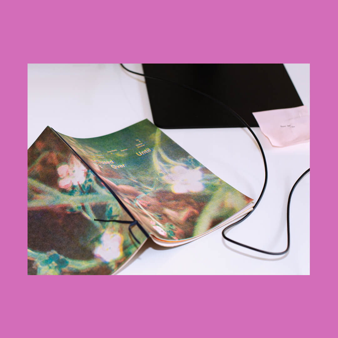
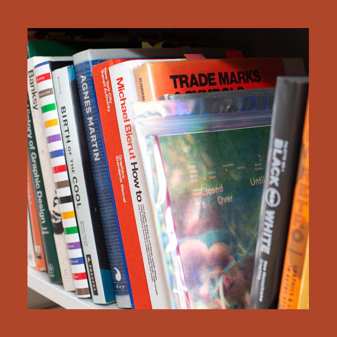
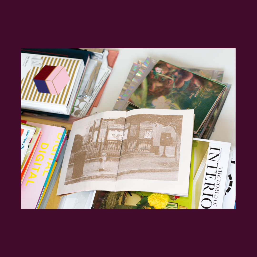
This zine, titled Closed Until It’s Over, serves as a visual reflection of an unprecedented moment in our collective history.
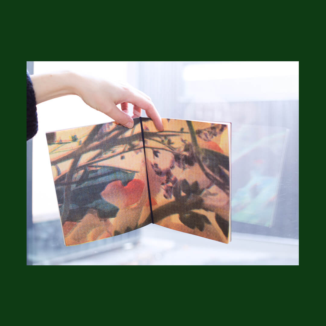
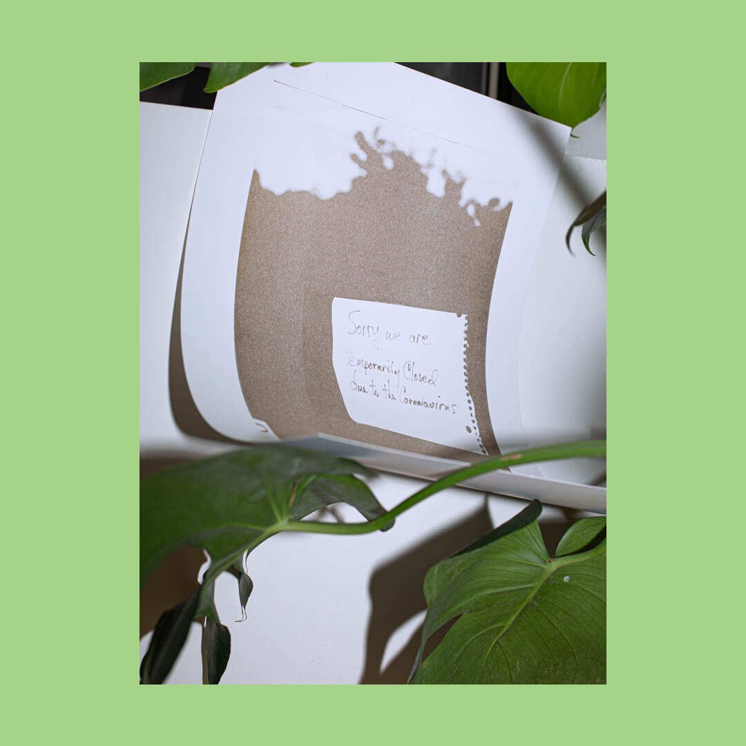
Unknowingly at the time, we would set out to create a zine just a few months later, packed with images of Covid-19 related signage around Louisville, Kentucky and juxtaposed against abstracted floral stills taken from Jessica Zimmer’s personal videos. This zine, titled Closed Until It’s Over, serves as a visual reflection of an unprecedented moment in our collective history. It attempts to reconcile the tragedies of the pandemic, the global, social reckonings, and the natural cycle of regeneration all happening concurrently in 2020. All proceeds from the zine are being donated to the Breonna Taylor Memorial Scholarship Fund, created by the University of Louisville’s Health Board of Directors
Content Strategist, Joshua Jean-Marie, sat down with Design Director, Jessica Zimmer, to learn more about how Jessica designed Closed Until It’s Over, where the idea to create the zine came from, and why it was important for proceeds to be donated to the Breonna Taylor Memorial Scholarship fund.
Joshua Jean-Marie: Jess, what initially sparked this idea to document Covid-19 related signage, and why did it feel important enough to pursue as a project?
Jessica Zimmer: In a time when so much feels outside of our control and our normal has been completely turned upside down in such a surreal fashion, documenting signage seemed like one small way to try to ground ourselves in this new reality. Documentation feels like a very human way to make sense of circumstances that we don’t fully understand. And in a way, there can be something soothing about it, even if the subject matter is strange or terrifying. When we decide to chronicle the occasion in a more formal way of ‘here we are right now’ and we’re marking this period with a photograph, with a printed piece–we are honoring the people who are also affected by these circumstances. We are staking claim to something that feels wholly untenable.
JJ: How was photography approached for this project?
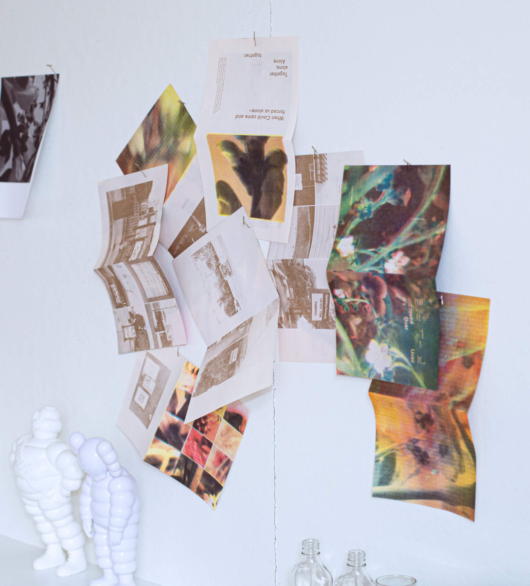
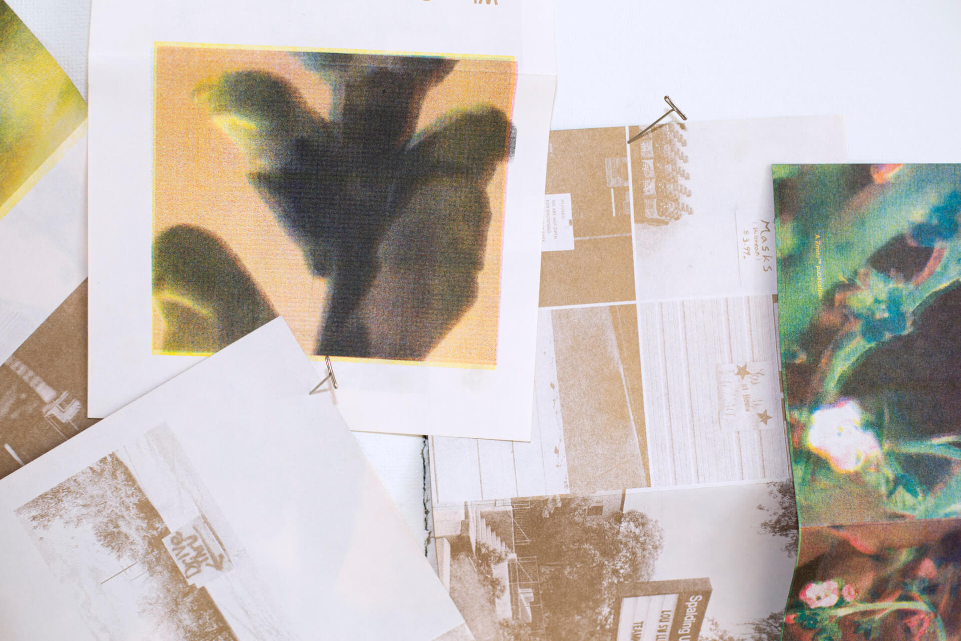
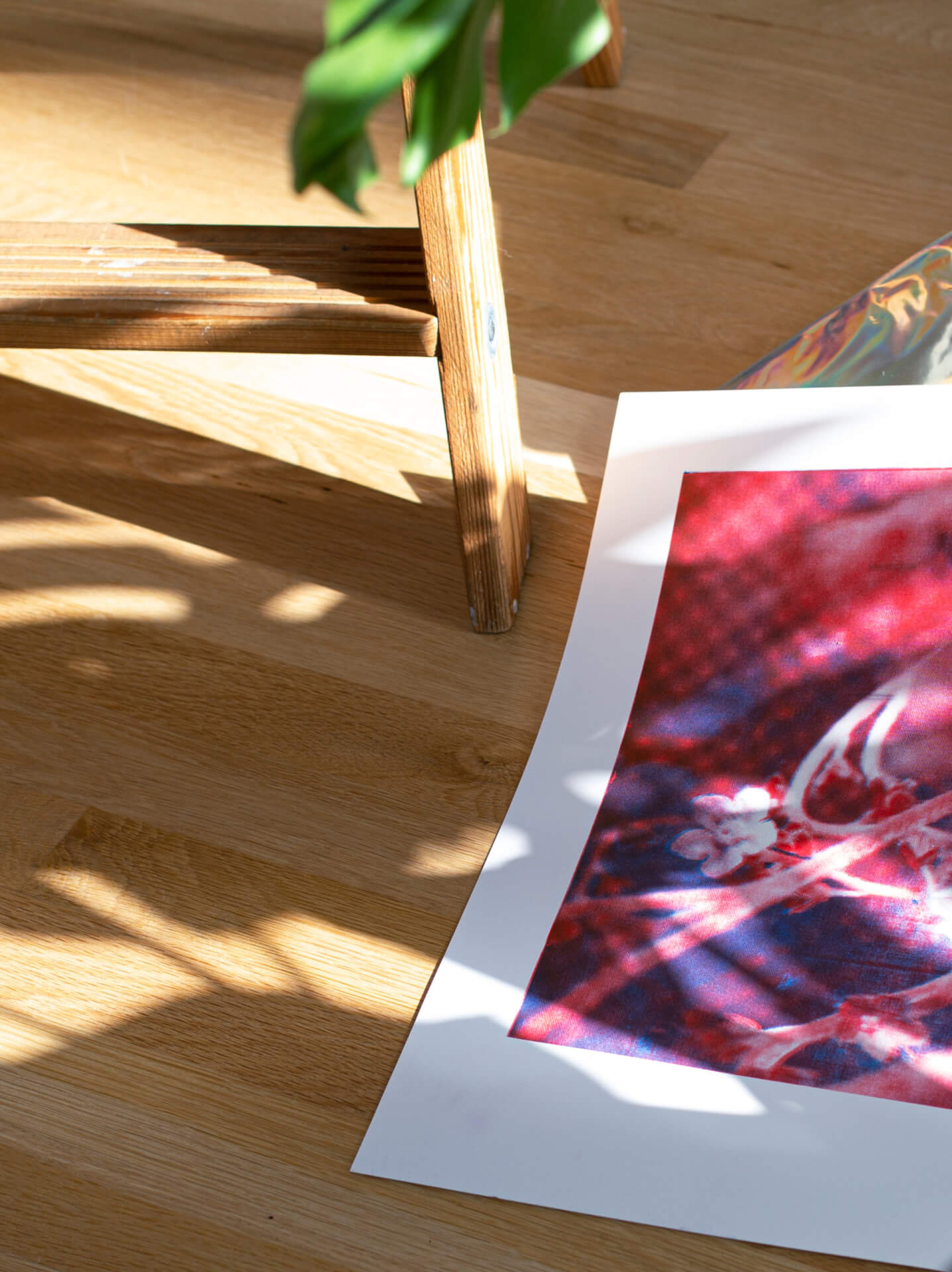
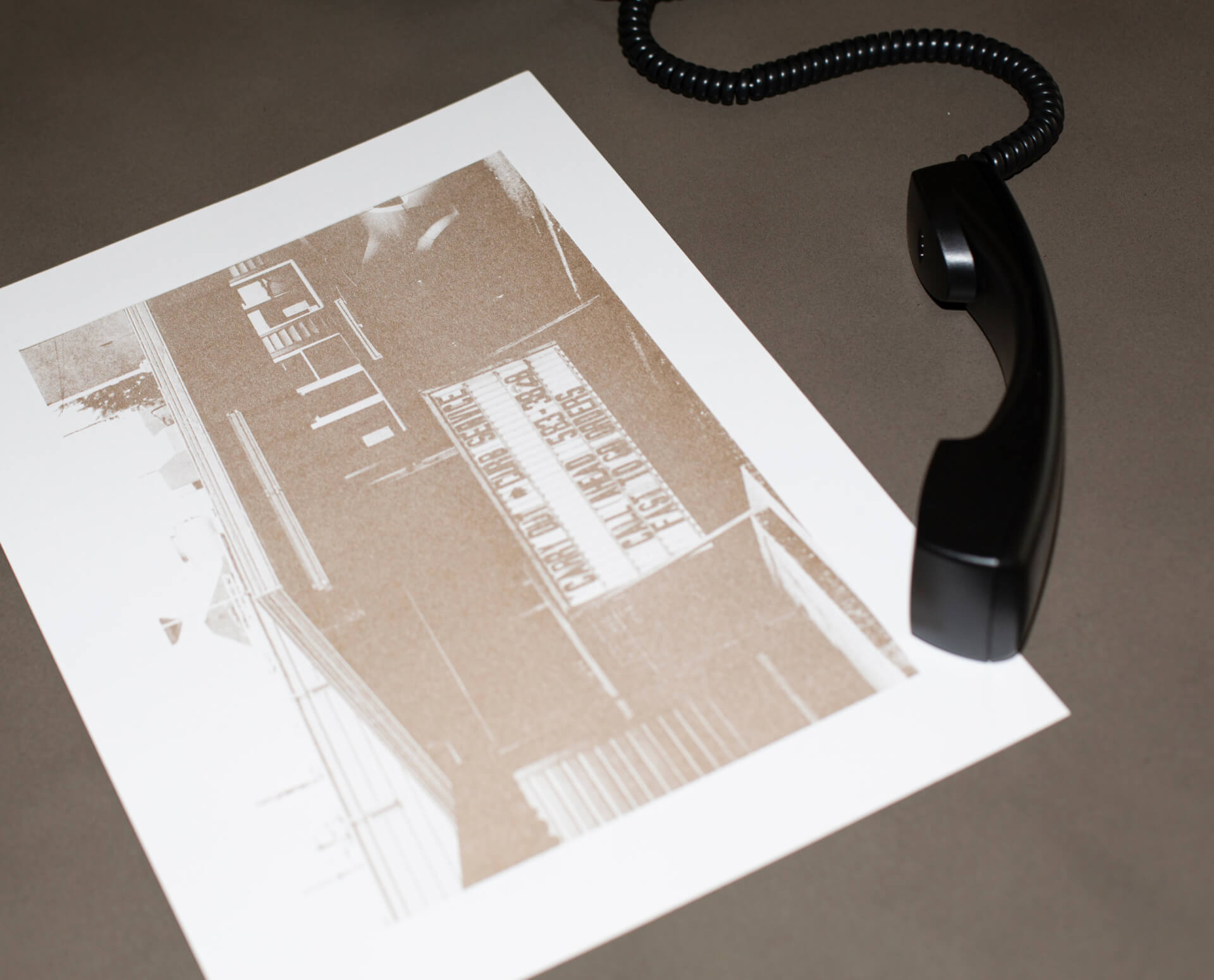
JZ: I didn’t want the photos to feel too precious. In times of crisis, reactions are based on quelling immediate needs and triaging the situation, so to speak, so I wanted the photos to represent that urgency and look unfiltered. Nothing too perfect, nothing overly edited. I think for many, this period of Covid has triggered tremendous feelings of isolation and fear. There’s a bit of the unhinged about it all. It’s messy. It’s uncharted. The juxtaposition of that loneliness apparent in many of the signage photos set next to the floral stills is a bit unnerving. It’s not immediately clear why these two subjects are paired with one another. That’s intentional to reflect how our human machinations have been so disrupted this year. It has forced us to stop and reevaluate, really everything in a way, and especially how removed from the natural world we have become.
In times of crisis, reactions are based on quelling immediate needs and triaging the situation, so to speak, so I wanted the photos to represent that urgency and look unfiltered.
JJ: What themes or patterns did you notice as you began to document more and more?
JZ: I noticed the human element in many of the signs. Quite a few were hand-made, hand-lettered, or printed off quickly from the office inkjet. That just reinforced that small businesses run by real humans, with very real, human problems, were being affected by this virus. These were mom and pop shops, local restaurants, you know? It really hit home that some of these businesses and, therefore, these people may not recover from this. There was a tangible, quite desperate vulnerability to it all.
JJ: Go into detail about the design, imagery, and intentional decision to print this project on risograph?
JZ: I wanted the photos to be the stars, really both the photos and the printing technique, which was risograph. This was my first time working with riso, and I really adored the process. It’s imperfect and raw, and there’s a bit of mystery as to how it’s all going to turn out, which seemed like an apt parallel to how this pandemic will evolve and hopefully, eventually resolve.
I hope it feels a little bit like they’re going on their own quiet and introspective personal journey as they page through it.
The photos really told me where they wanted to be placed, you know? I would consciously try to pair the florals with the signage photos in a way that might tell a story, but the story was pretty loose and organic. I imagine different people will create other narratives, and that’s how I wanted it to be. I hope it feels a little bit like they’re going on their own quiet and introspective personal journey as they page through it.
JJ: Throughout the zine, what components were kept consistent, and why?
JZ: How we use the ink colors is consistent–the signage photos are in metallic gold, the florals are in combinations of red, blue, black, and yellow. And that was to create a kind of rhythm throughout the piece, so it didn’t feel too one-note. It also serves to further contrast the differences between the natural world and the man-made world.
JJ: What are some elements within the zine that might be easy to overlook at first glance?
JZ: I suppose it might be easy to overlook the through-line of the story. It could just be seen as something pretty to put on your coffee table or add to your print collection, and there sincerely wouldn’t be any judgment if that were the case (I have plenty of publications that I purchased solely for that reason!) But returning to the themes of isolation, desperation, and humanity and then the hope and the perseverance of the natural world–those themes start to emerge, I think the longer one spends thumbing through the pages.
JJ: Why was it important to donate proceeds from this zine to the Breonna Taylor Memorial Scholarship Fund at the University of Louisville?
JZ: It’s essential for creative people to have outlets for their creativity that are not reliant on a project brief or a client-ask. It keeps us motivated and in touch with why we went into a creative industry in the first place. But having said that, this zine felt much more significant than this somewhat narrow motivation. It felt urgent to tie this project back in with the community here in Louisville, and in particular, with Breonna Taylor’s legacy, in ways I find difficult to articulate because it’s just so massive. Our city is grieving for her, deeply. And in some small way, we as a company are just trying to hold space for our collective grief, for our city’s grief, for her community’s grief, and this was our way of channeling all that hurt, all that rage, and sadness, into something that could aid in serving a greater good.
It felt urgent to tie this project back in with the community here in Louisville, and in particular, with Breonna Taylor’s legacy, in ways I find difficult to articulate because it’s just so massive. Our city is grieving for her, deeply.
JJ: What did you and the Zimmer-Design team learn while working on this project? Any advice for someone looking to step into riso printing or a similar project?
JZ: We love collaborating as a team on projects. It’s a lovely, organic exchange of ideas, and I don’t think we take for granted how special that is. So it was really meaningful to me personally, in the middle of all this chaos and tragedy, to be able to find some joy in creating something from nothing, together, as a group of like-minded people just trying to get through this time in the best way we know how–by doing, by making, by giving back.
My advice for working in riso would be to try to let go of all of your preconceived ideas of how you thought it would look and just go with however it turns out–that’s the magic of it all. And partner with a printer you trust who is game to take the wild ride with you. (Shoutout to Tim Robertson of Risolution Press, who printed the majority of the zine and held our hands the whole way through the process, and to Cereal Box Studio of Cincinnati, who came through clutch when our yellow drum wasn’t delivered in time!)
JJ: Thanks so much for your time Jess! I’ll be sure to include a link below for those interested in purchasing a copy of Closed Until It’s Over.
JZ: Thanks, Josh!
To purchase a copy of Closed Until It’s Over, click here
Image credits:
Photographer: Joshua Jean-Marie
Creative Direction: Jessica Zimmer