Fleur De Less
Questioning A City’s Symbol
Let me preface this spiel by stating I think Louisville is a beautiful place to live. It has the comfort and character of a small town and the intermittently satisfying energy and creativity of a city 10 times its size. A 20-minute drive in one direction takes you to the country, and in 20 minutes in the opposite direction, you can find yourself in the city. This town’s personality is somewhere between weird, pleasantly oblivious, slow and southern/midwestern. I’ve lived here for the majority of my life, so I may be biased (I can sometimes be a jaded homer or an overly-confident ambassador), but Louisville has a lot going for it. Like anything, though, it has some quirks that drive me a little crazy. Aesthetically-speaking, one quirk in particular blemishes this town’s collective image and inhibits us from owning a unique visual identity: the overuse and abuse of the fleur-de-lis.
I understand this might be an unpopular opinion, especially in a city blanketed in fleur-de-lis logos, decals and tattoos, but it’s one that I’m very comfortable sharing. I have no problem with the symbol itself–it is a beautiful shape with deep history. Its design is inspired by a lily, and I like lilies; but like any symbol used for hundreds of years, it has some positive history and some really negative history. At one point, the fleur-de-lis was used as a hot iron branding mark of punishment on the right shoulders of runaway slaves in Louisiana. One would argue that after being used for something so horrific, the symbol probably should’ve been retired long ago to join the garbage pile of evil emblems accumulated throughout history. On the other hand, historians and anthropologists widely agree the fleur-de-lis has been redeemed as a symbol of unity in places like New Orleans, Quebec and various French-speaking locales around the world. The fleur-de-lis is just a victim of accepted (and expected) mediocrity.
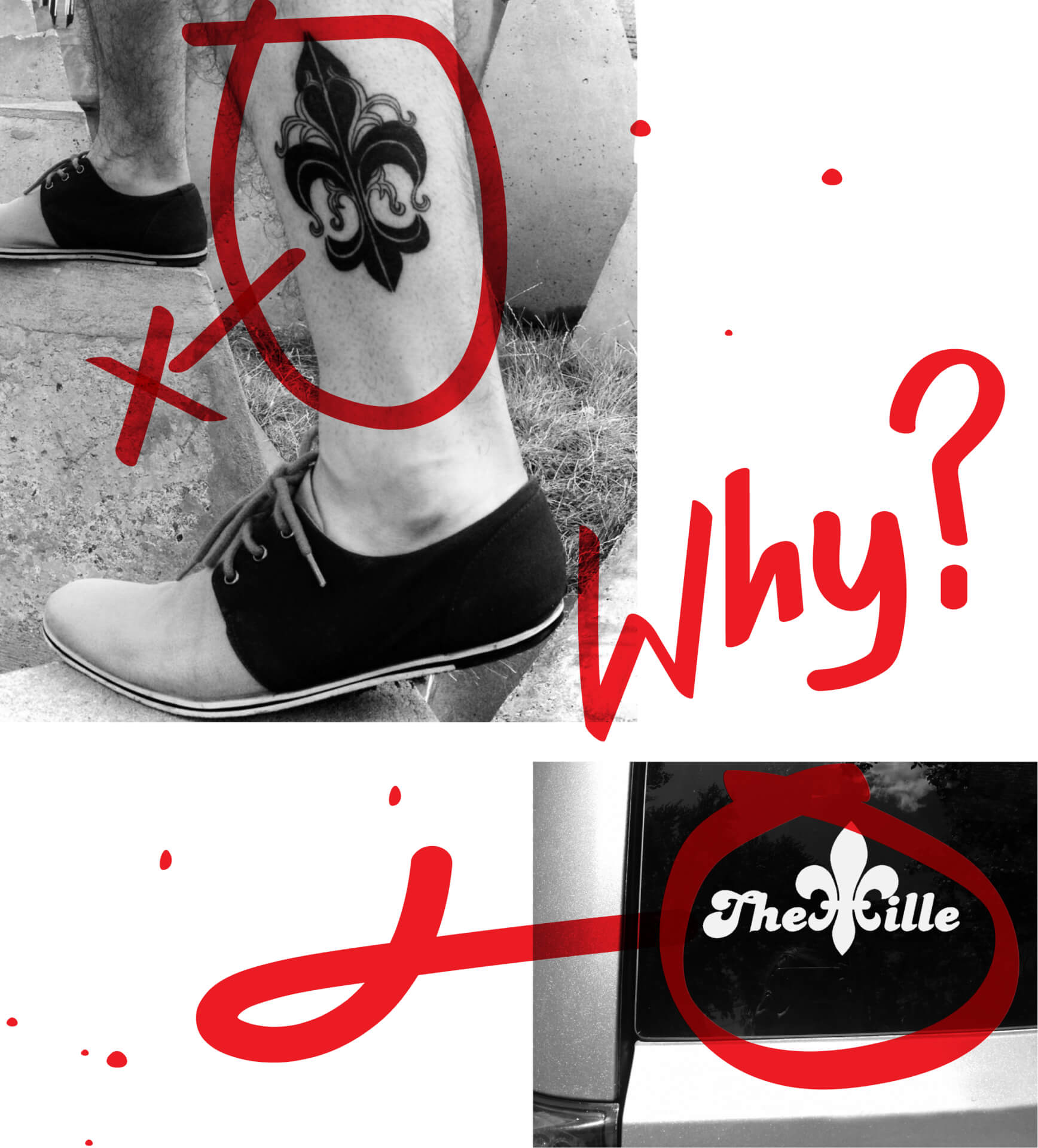
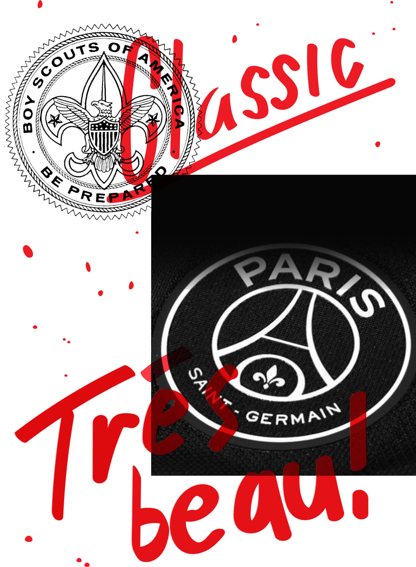
To the fleur-de-lis’ credit, there are brands that use it well. The New Orleans Saints are an example of iconic American sports branding. The Boy Scouts of America logo is also kind of nice; it’s balanced and doesn’t rely too heavily on the fleur-de-lis shape alone. The soccer team Paris Saint-Germain F.C. uses the fleur-de-lis tastefully at the bottom of its crest as opposed to a huge, honking, central element dominating all the other elements. A fleur-de-lis symbol is clearly easy to use and a general crowd-pleaser, but the symbol in itself is not what makes me cringe. Here’s a brief list of some local Louisville fleur-de-lis violations:
A Lack of Creativity
Using a googled image of a fleur-de-lis as a part of your logo isn’t doing your brand justice. On the flipside of that, I often see attempts to morph the fleur-de-lis with an unrelated object. Forcing a symbol derived from a lily to “animorph” into a chef’s hat, a deer head or a wine glass is a bit of a stretch.
A Symbol Out of Context
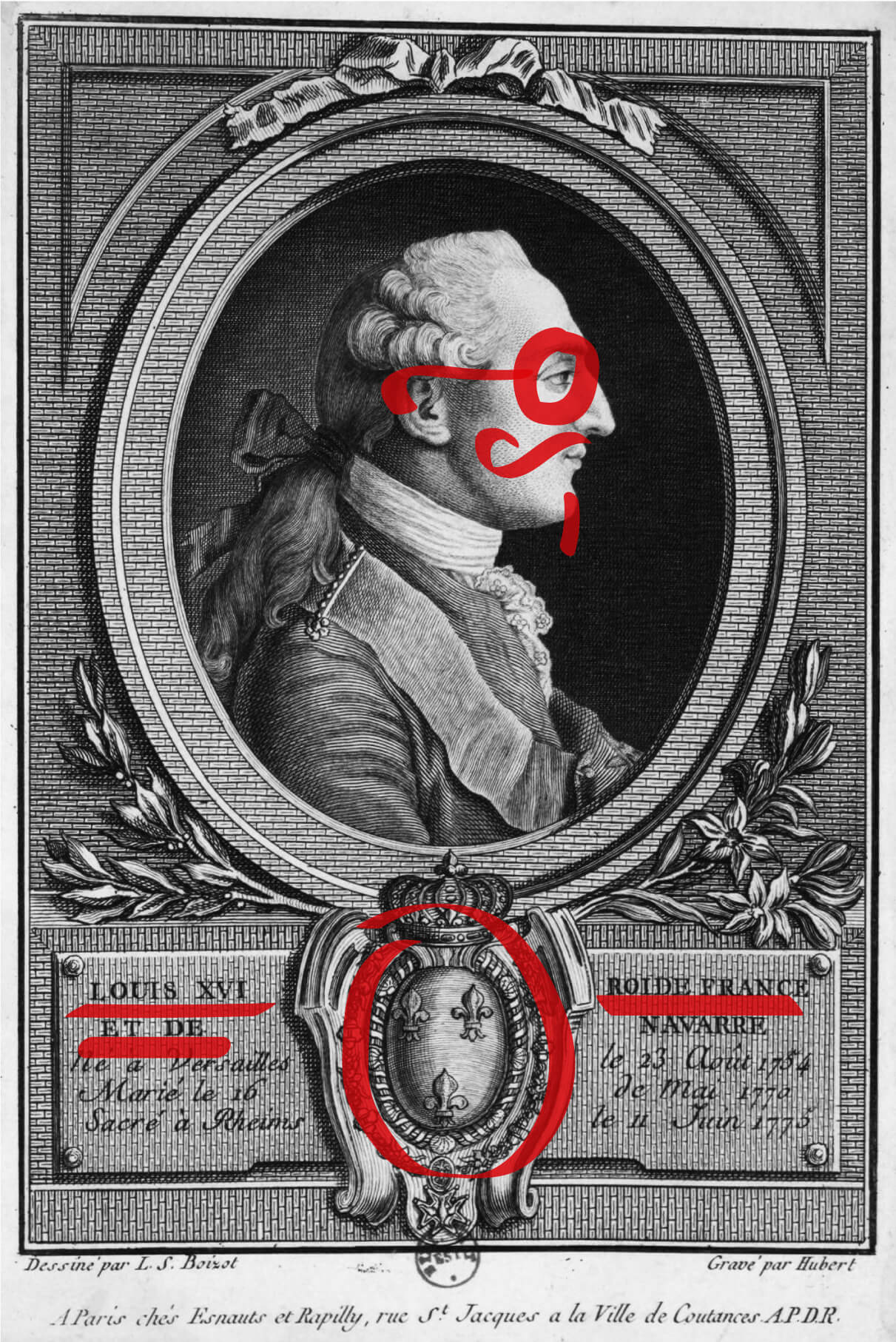
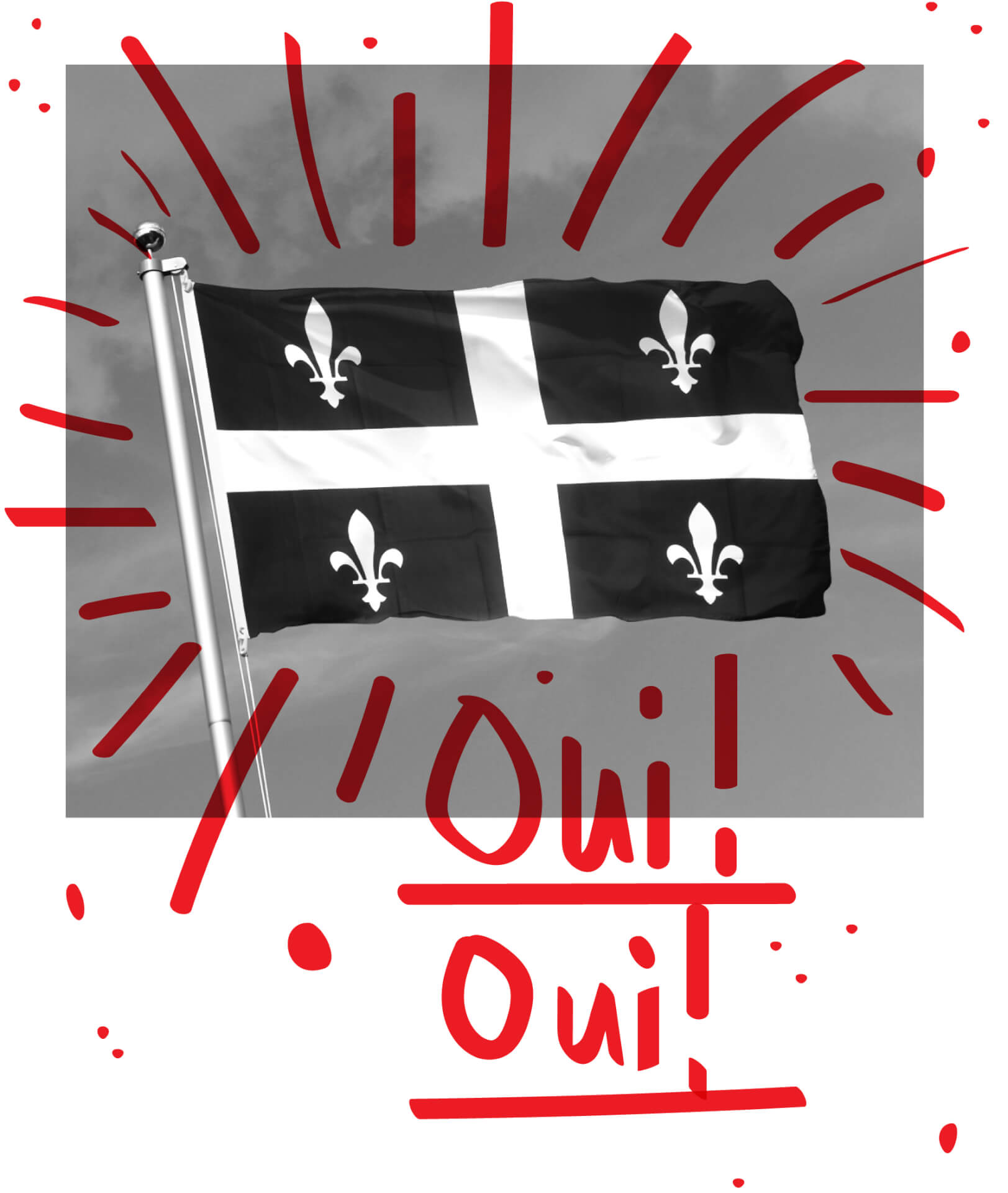
Place, space, who and where are all top considerations for any “good design.” We are Louisville. We have an identity that needs to be explored. We are not New Orleans, Montreal or St. Louis. Fleurs-de-lis are symbols of French cities, and let’s be honest: we are not a French city. Yes, there are three fleurs-de-lis on the City of Louisville flag. Yes, we were named after French King Louis XVI. But French culture is what makes you a “French City,” not simply being named after a monarch who died more than two centuries ago. There is no semblance of French culture or heritage here, minus a handful of French-ish Cajun or French-Creole restaurants. Business owners, local designers and tattoo-sporting folks might ask themselves, “Why am I using this symbol?” before making their next move.
Local Redundancy
In most fleur-de-lis branding examples in Louisville, the company is marketing to a local audience. Therefore, the audience already understands where they are, and it’s unnecessary to remind them with a giant “local” symbol. It is so much more useful to find or create an original symbol of your own.
Originality–Or the Lack Thereof
When it comes to locales claiming the fleur-de-lis, Paris, Montreal, New Orleans and countless other notably French cities will inherently own the symbol. We can’t really catch up to them. That doesn’t mean we should stop using it altogether, but maybe we should entertain the idea of exploring other symbols.
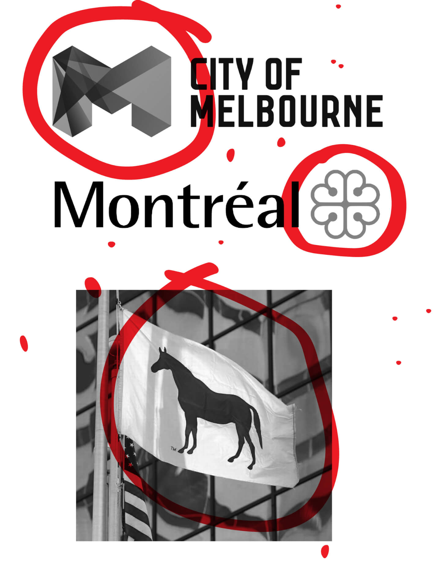
That’s the real idea behind this fleur-de-lis overkill argument. As an up-and-coming city, we get sort of lost in the shuffle, not really claiming our own unique identity because we’ve relied on a symbol that other metropolises truly embody. Places like Tokyo, Montreal and Melbourne, are embracing dynamic brand identities with unique symbols that help illustrate their culture. Tokyo only started using its bold, green ginko leaf logo in 1989. Montreal adopted its iconic red floral mark in 1981. Even more recently, the city of Melbourne created its isometric “M” identity in 2009. And, like it or hate it, our neighboring city to the east, Lexington, is building an ownable brand with the “Blue Horse/Big Lex” identity created by DJ Stout and Michael Bierut. It’s slowly but surely catching on.
Louisville is a place with a wealth of heritage and history that is calling for a symbol of its own. The more this place grows, the more we need a shape or design that embodies us, our culture and our aspirations. Let’s create it together.