Dark Matter Coffee Core Brands Redesign
Packaging Design
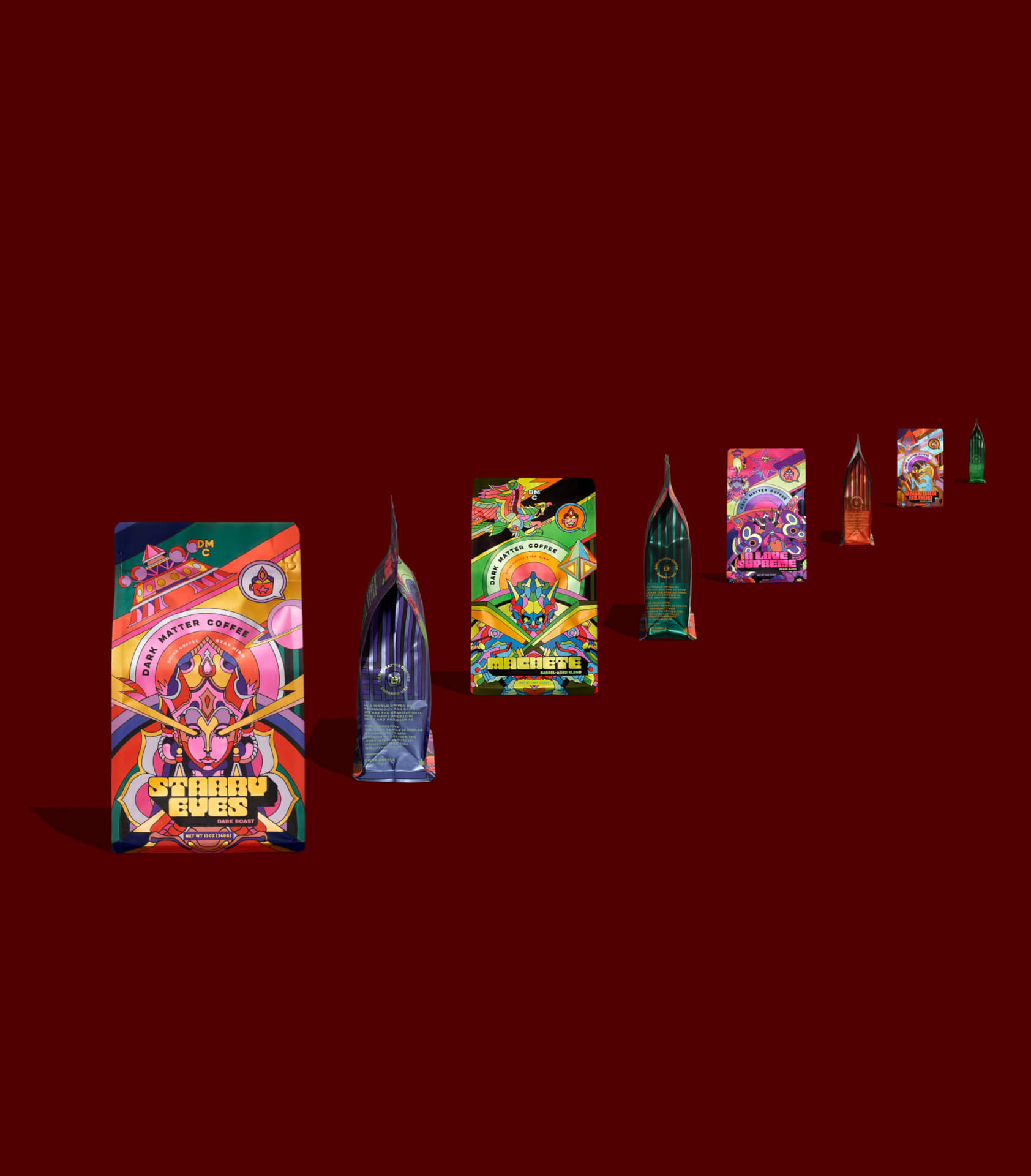
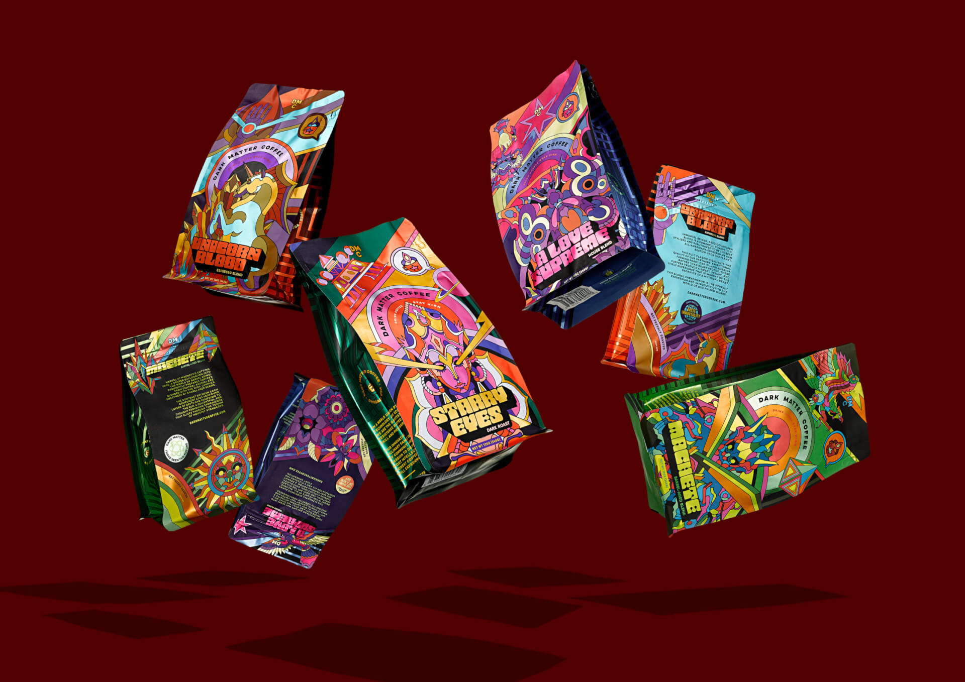
Dark Matter Coffee’s long-established core brands–Unicorn Blood, A Love Supreme, Starry Eyes, and Machete–make up the foundation of their Portfolio Blends and are diehard fan favorites. (If you know anything about Dark Matter, it’s that they are continually pushing the boundaries of coffee while still consistently nailing the classics.) After many illustrious years without a design update, these four coffee bags were due for a reboot. Cue the mind-bending, galaxy-hopping, sci-fi-centric, creative brief.
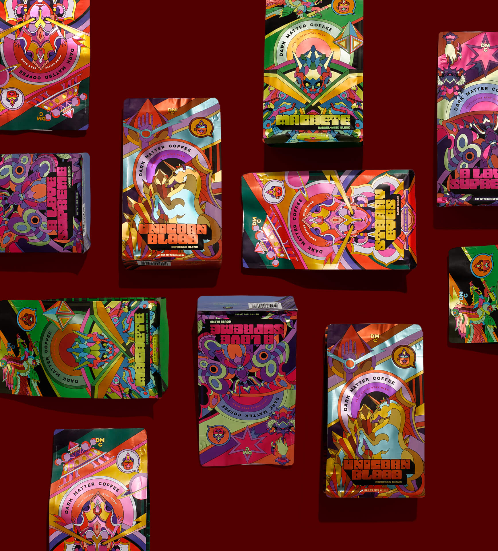
Ever the visionary company, Dark Matter framed up the rebrand to Zmmr with a dual purpose: to captivate new customers with unstoppably beguiling visuals, and to retain their existing, loyal customers who had come to know and cherish their favorite coffee bean packaging. The cherry on the top–to make these designs a category disruptor.
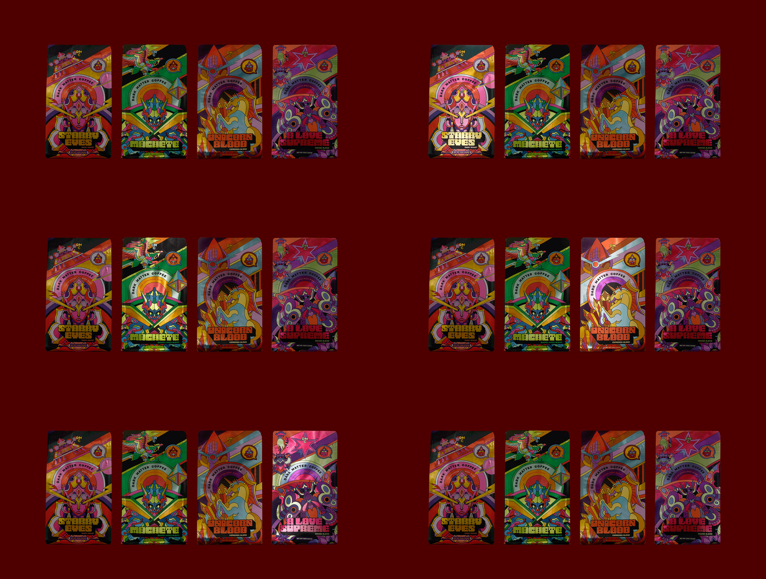
We developed rich stories behind each of the four blends complete with complex, layered visual references, out-there symbolism, and detailed color palettes.
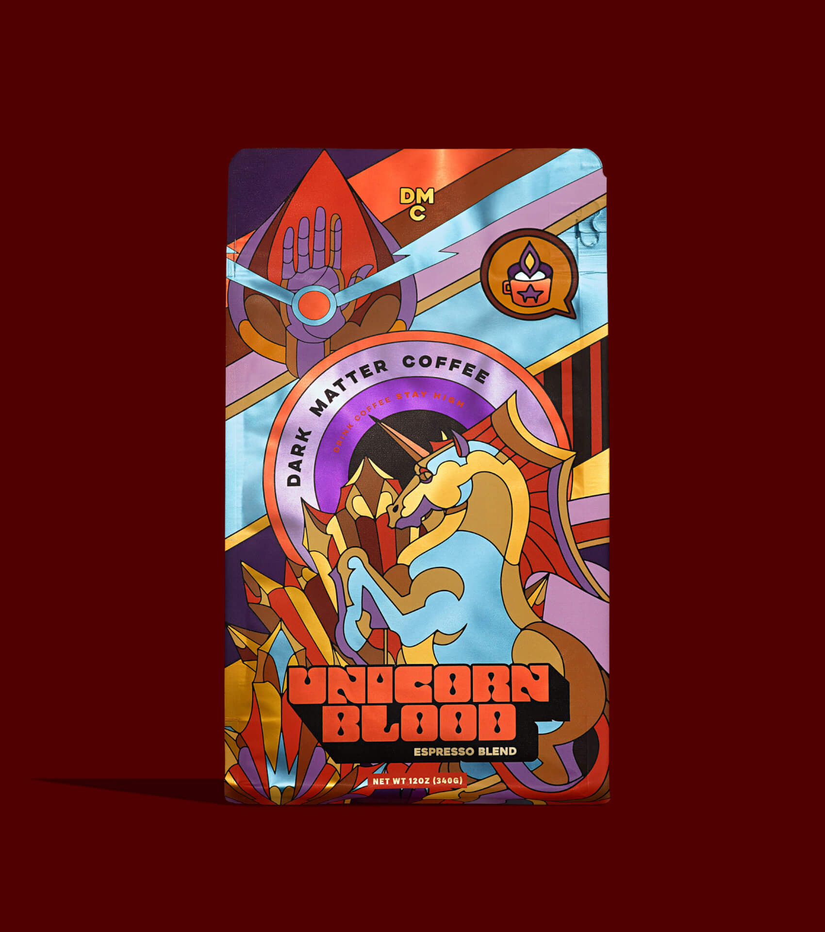

Staying true to Dark Matter’s playful, unconventional spirit was another mandatory. So for this project, we did a deep dive into research. We developed rich stories behind each of the four blends complete with complex, layered visual references, out-there symbolism, and detailed color palettes. After identifying all these elements, we worked closely with artist Raul Urias to craft the intricate illustrations shown on the final bags. Every design element on the package ties back into the overarching portfolio story, that of a New Worlds Fair–a fantastical vision of the future of coffee and possibly, dare we say, the planet.
AIGA 365, Packaging Design Category Winner
Graphis Packaging 10, Gold.
Dieline, Dieline Awards 2021, First Place, Coffee & Tea Category.
The Type Directors Club, Winner 2020.
AIGA Louisville 2020.
Dark Matter Coffee Core Brand Redesign, Mindsparklemag.com, April 2, 2021.
Dark Matter Coffee’s Core Brand Redesign With The Help Of Zmmr, Printmag.com, April 21, 2021.
Zmmr’s full-bodied rebrand that’s out of this world, Pentawards, May 3, 2021.
Dark Matter Coffee Core Brands Redesign, TheDieline.com, May 26, 2021.
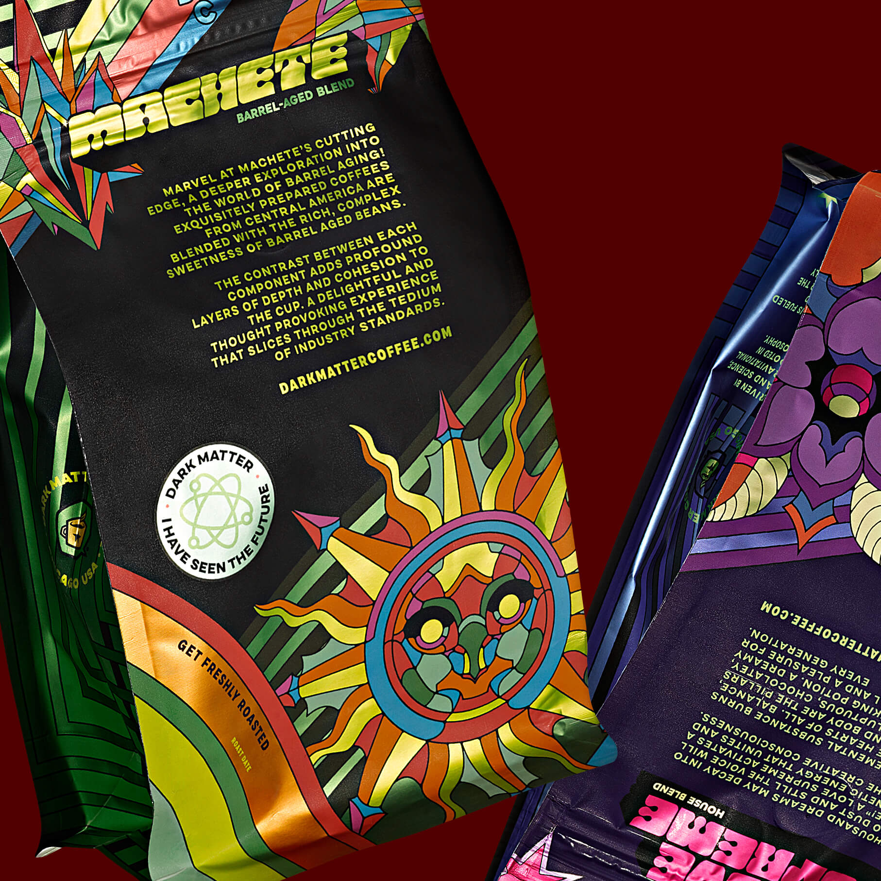
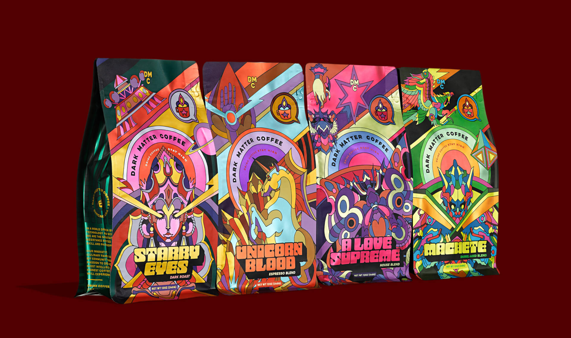
Every design element on the package ties back into the overarching portfolio story, that of a New Worlds Fair–a fantastical vision of the future of coffee and possibly, dare we say, the planet.
