Noon Whistle Brewing
Packaging Design
The smell of fresh beer brewing produces an enveloping sensory reaction, which sends a signal to your brain that good things are coming. The genius of Noon Whistle brewery is that they use that neurological connection to their advantage, with an open floor plan that lets you walk headfirst into the brewing process and all of its deliciousness, creating a connecting thread – the camaraderie of beer.
When Noon Whistle approached us about designing their first packaged beer cans, we knew we had to create something that would visually emulate the experience with the brand. They were not shy about wanting something bold, bright and memorable that would fully capture the spirit of their brand.
They were not shy about wanting something bold, bright and memorable that would fully capture the spirit of their brand.
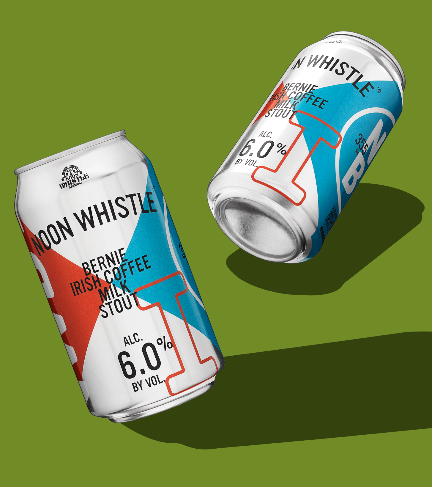
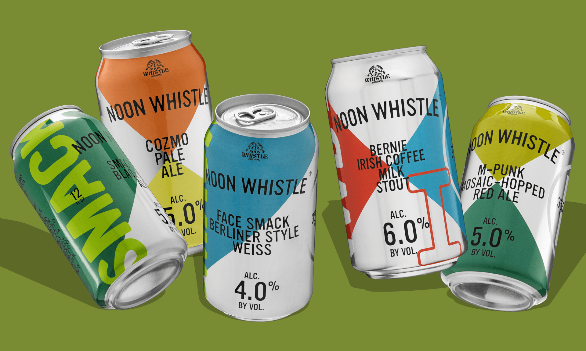
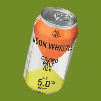
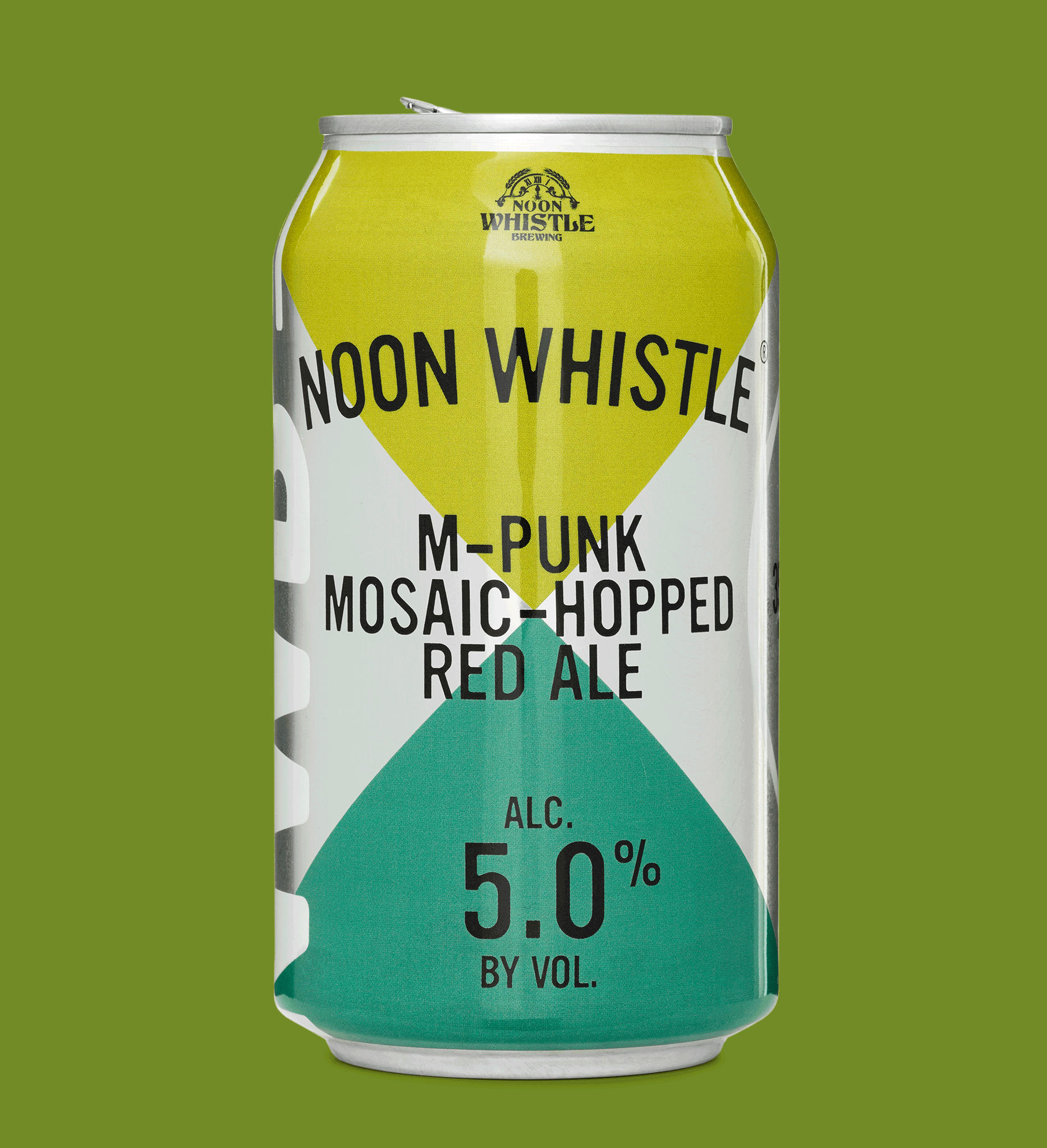
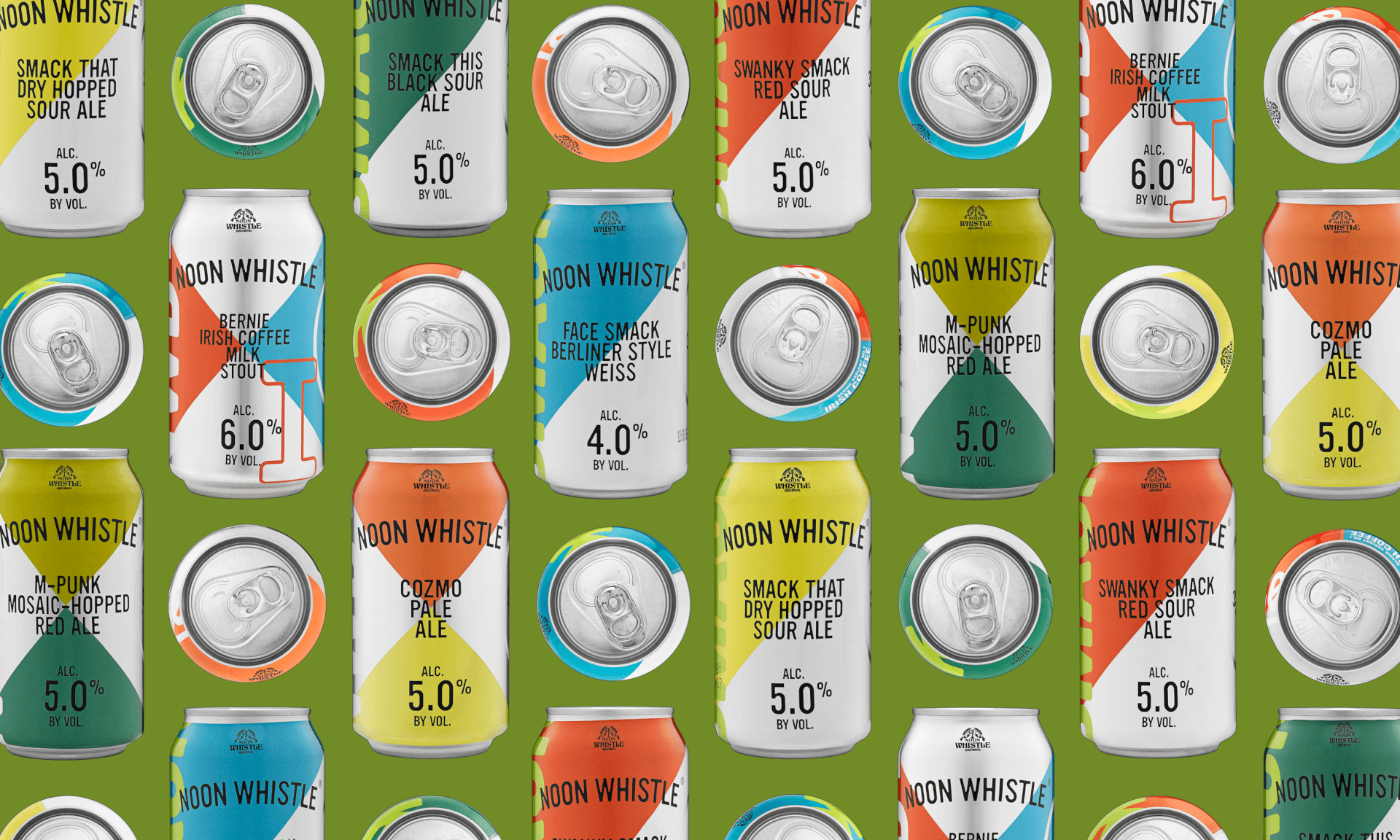
When staring across the beer cooler landscape, brands have to be able to stand out, or they risk being overlooked. We chose an unexpected color palette to set them apart and applied a more simplistic deconstructed argyle pattern, giving Noon Whistle its own distinguished look in the field. Layering in thin black and chunky white type over the blocks of color enabled us to play off the deconstructed theme. The result is a punky, fresh vibe that suits the energy of the brand and creates a visual experience that rivals the sensory taproom experience.
HOW International Design Awards, Packaging Outstanding Achievement Winner 2018
ADDY Louisville, Silver Award Winner 2018
Counter-Print Packaging, Counter-Print ©2018
PRINT, PRINT Regional Design Annual 2017
AIGA Louisville, The SHOW Award Winner 2016
AIGA Louisville, The SHOW Judge’s Choice 2016