Prindle Post
Print Design – Publication
You wouldn’t normally refer to a journal of weighty current ethics issues explored in meaty, short-to-mid-length articles as “cool,” but the Prindle Post isn’t your normal publication.
It was originally published online by the Prindle Institute for Ethics out of DePauw University in a time when the print industry was folding into the digital realm. But the Prindle Post is different, and it only made sense for these thoughtful editors and writers to take their work to the presses.
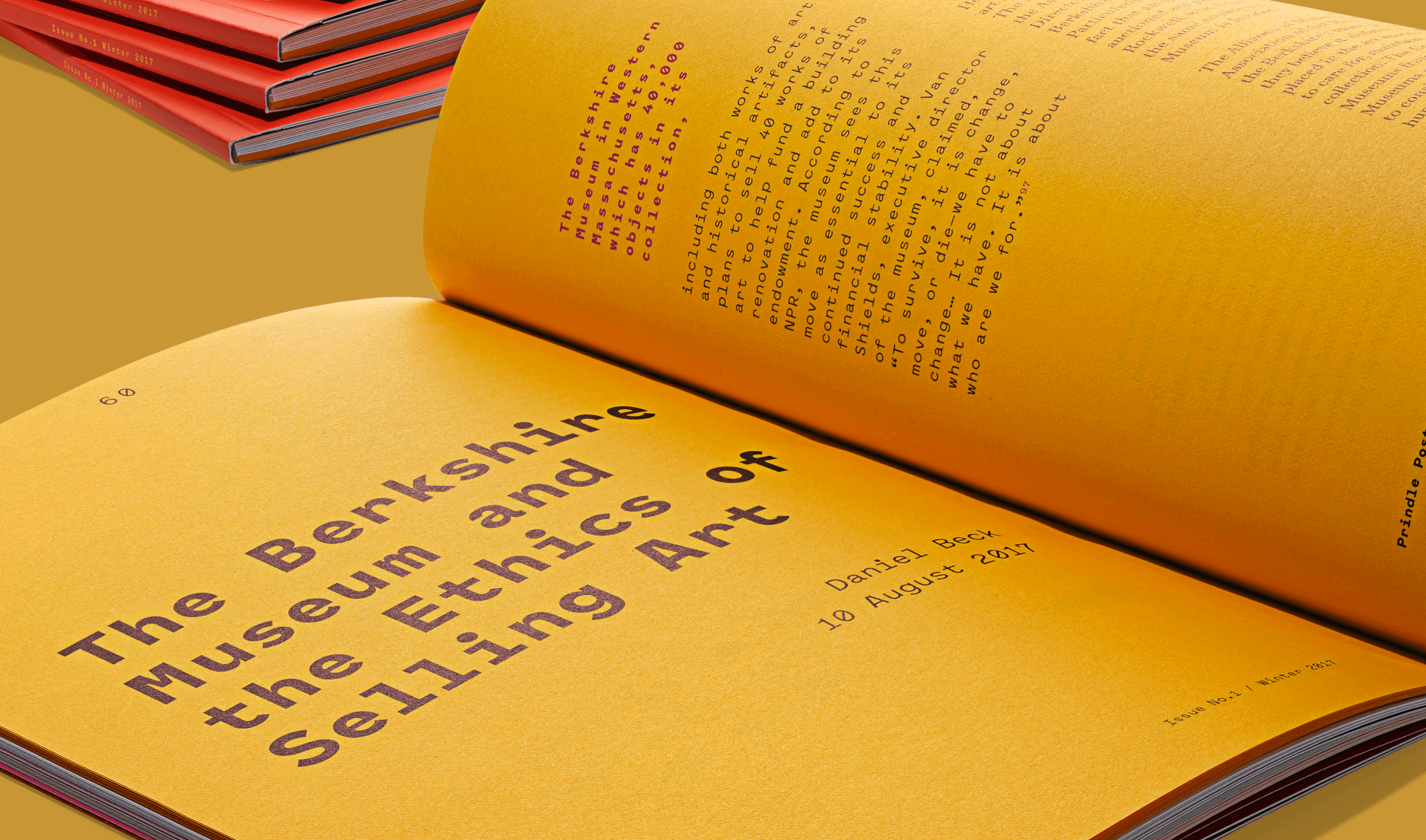
Throughout the publication, we featured deconstructed layouts for the articles based on a two-column grid but then happily broke the typical order of things with floating text blocks and multiple text styles.
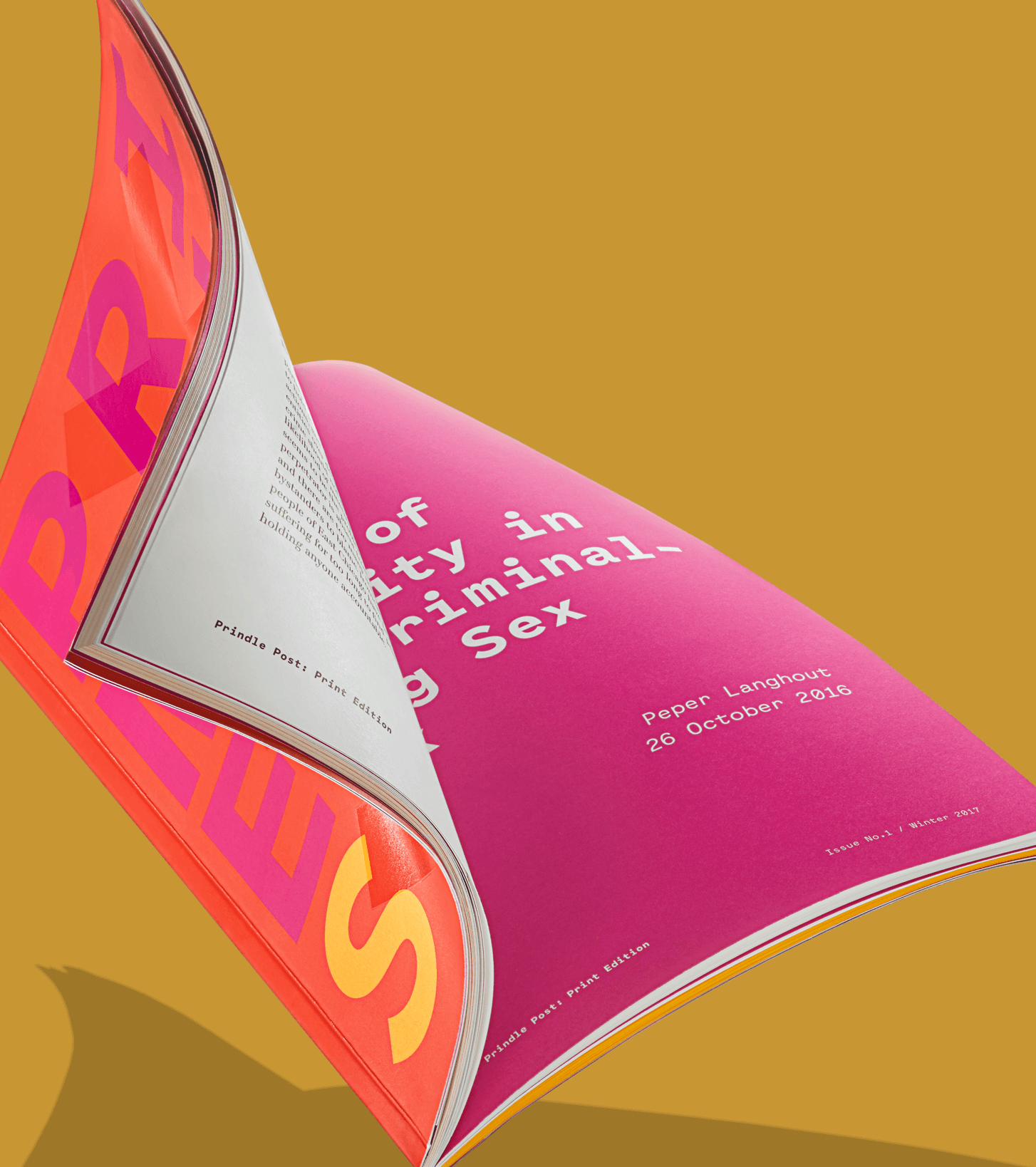
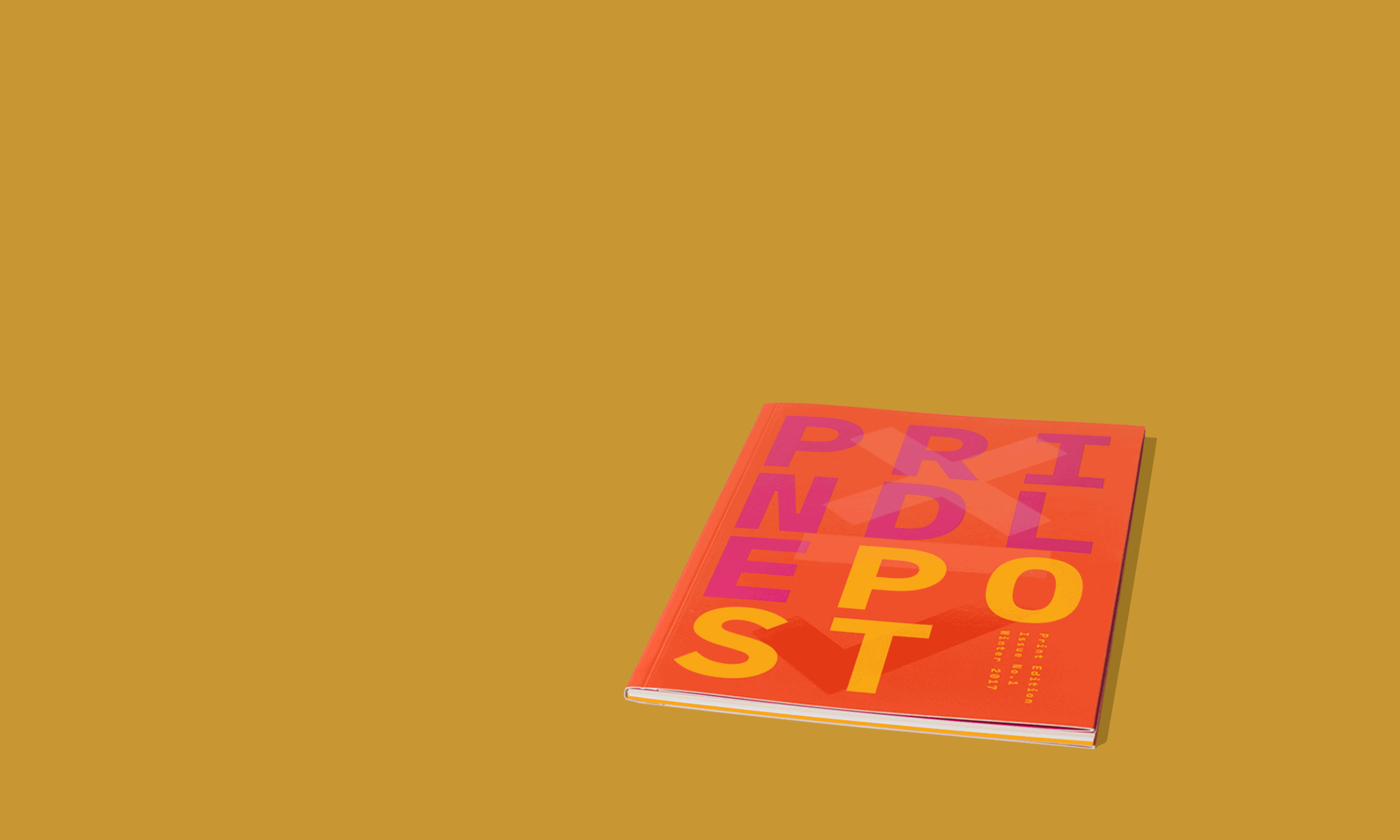
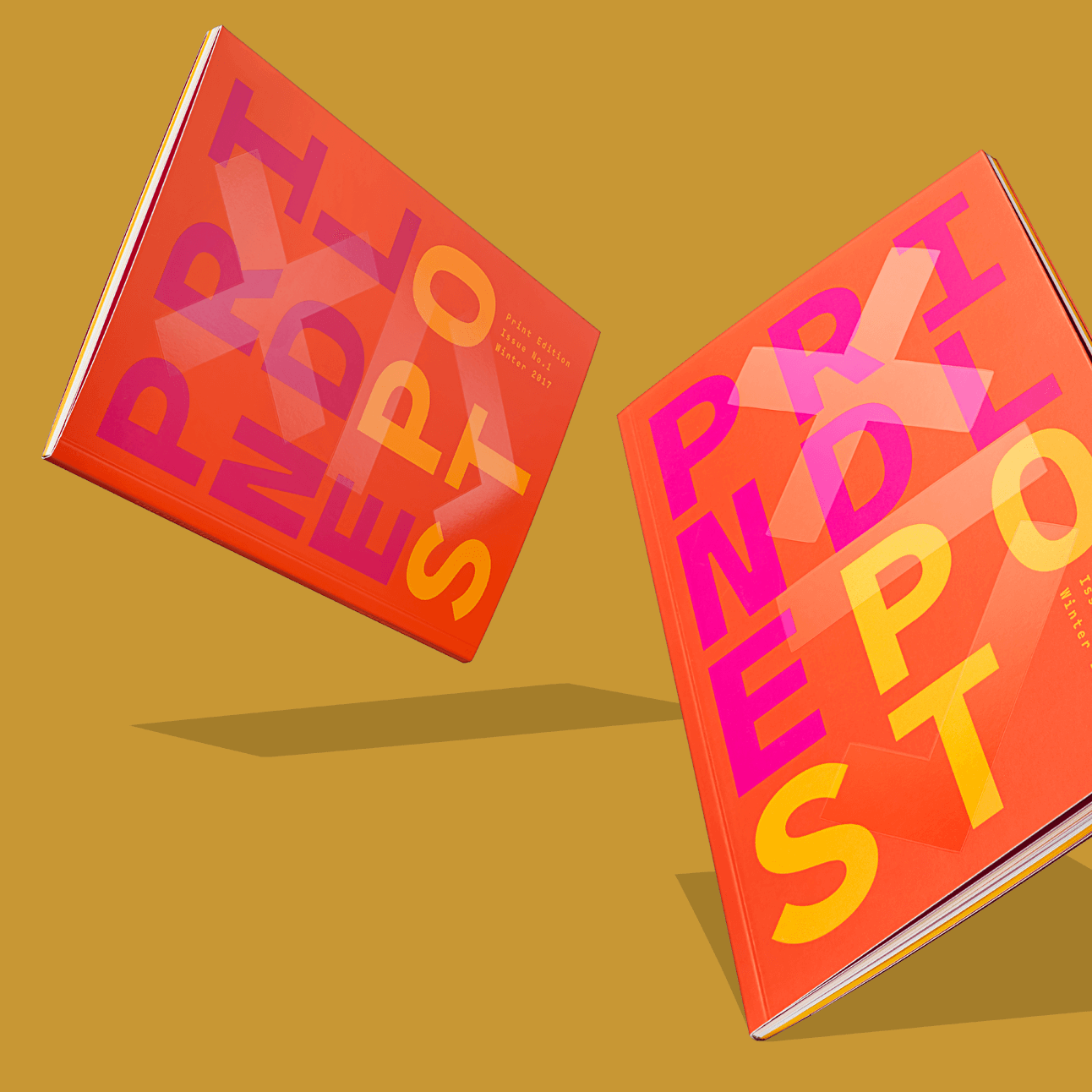
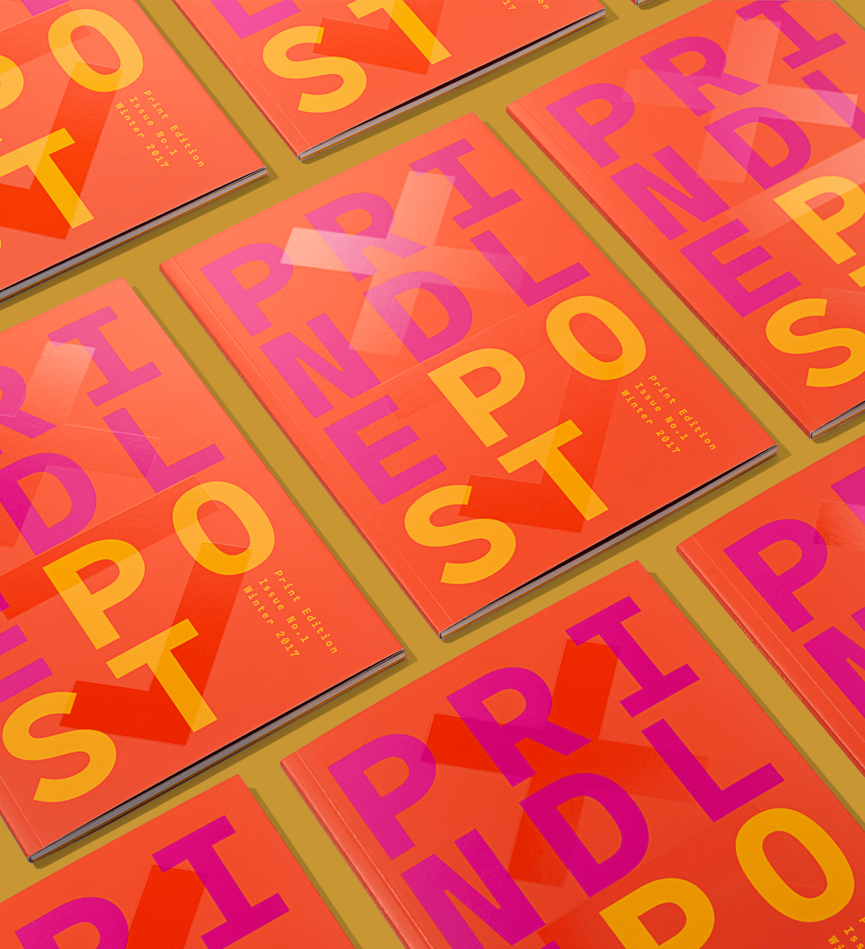
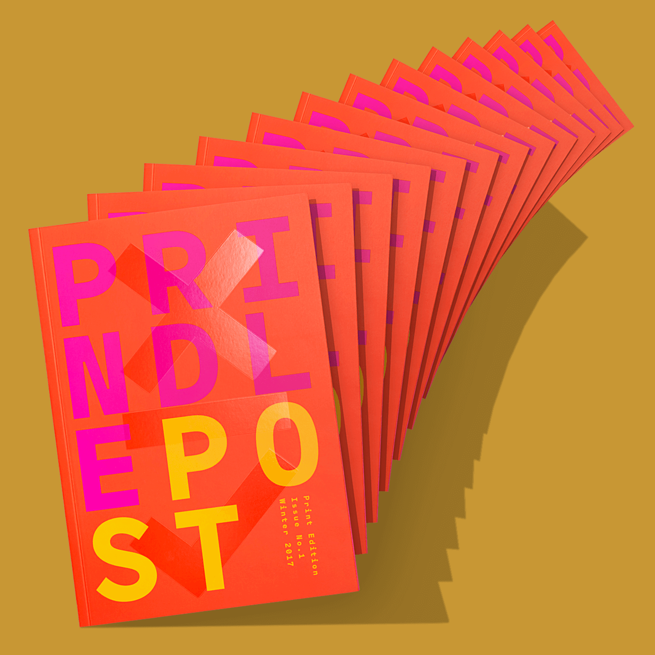
From the beginning of this project, we were given free reign to create a concept vessel, cover and interior page designs. It was an overwhelmingly refreshing opportunity that we grabbed by the horns and ran with. We wanted this piece to be smart, simple and beautiful, starting with the spot gloss X and check mark on the cover, inside folds and back cover, which represent the idea of ethics and choice.
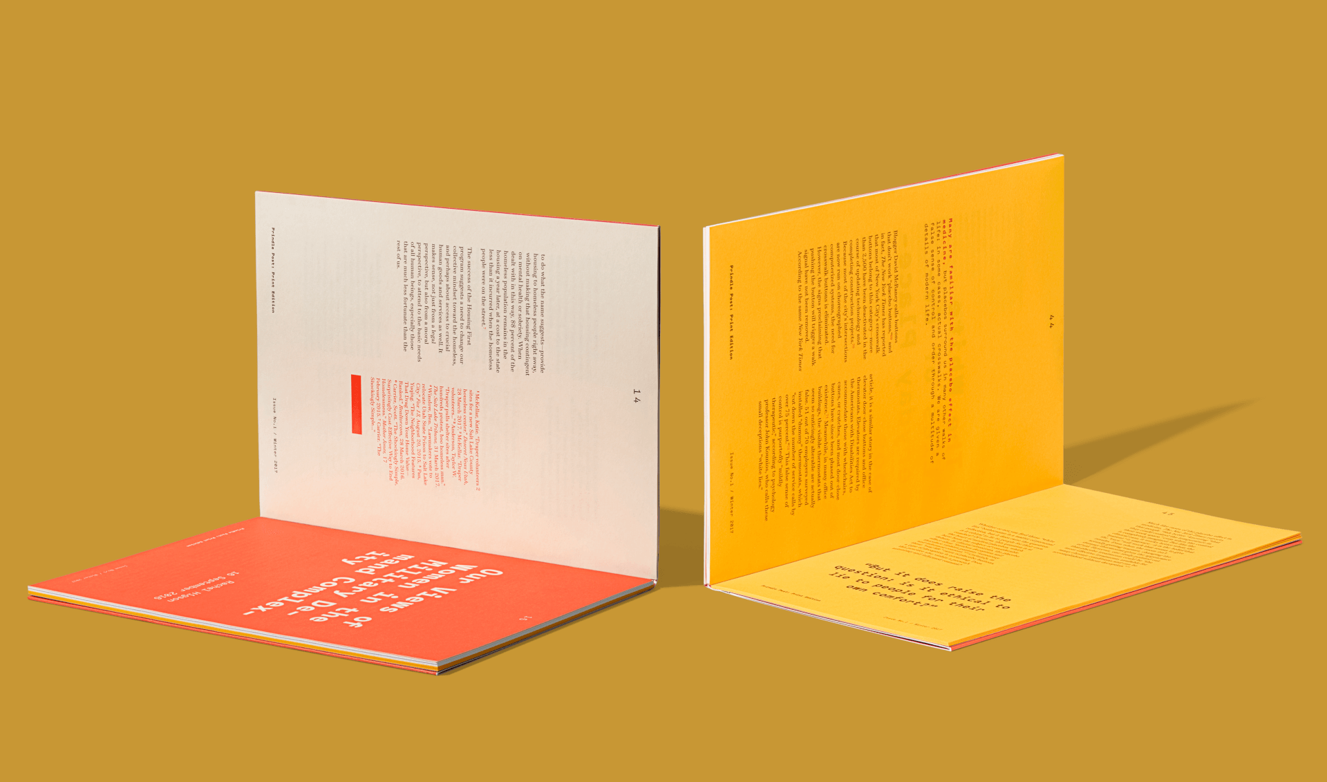
Throughout the publication, we featured deconstructed layouts for the articles based on a two-column grid but then happily broke the typical order of things with floating text blocks and multiple text styles. Interior papers transition from French’s Insulation Pink to Mohawk’s Superfine to Neenah’s Astrobrights, while a color palette of bright red, rhodamine red, sunflower yellow and deep brown populate the pages with rich hues. The cover features front and back roll-folds with an overall soft touch coating and spot gloss varnish. It’s the type of piece that could keep print publications in style and worth getting your hands on.
STA Society of Typographic Arts, Winner 2018
AIGA Louisville, Book Covers/Magazine, Winner 2018