Upstairs Hospitality
Branding, Naming, Creative Direction, Interior Design, Environmental Design, Identity System, Wayfinding, Digital Content, Photography
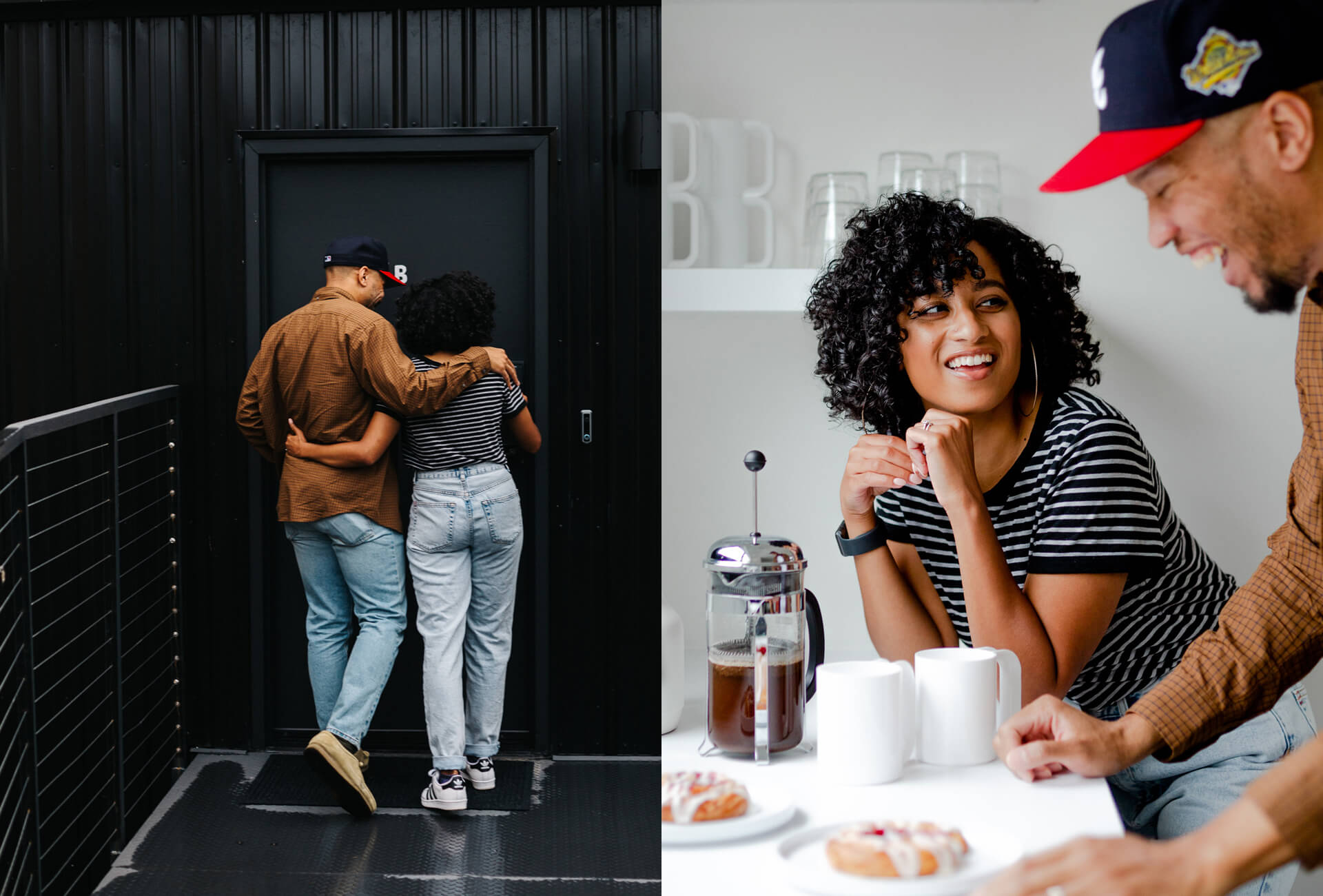
When Zimmer-Design owners Jim and Jessica Zimmer were renovating their office building, they also set out to construct two Airbnb suites on the property unlike any other in their city. Putting a heavy focus on design from the inside, out, and touching everything in-between (including the branded collateral, signage, digital content, and photography) was top priority in the creation of Upstairs.
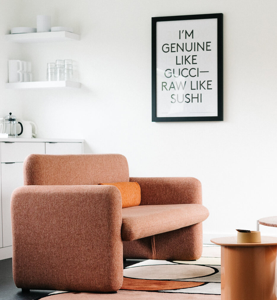
As children of the 1980s, their fondness for the bold, pop-inspired design cues of that decade influenced the furniture and decor curation of the spaces. Emphasis on bright, unapologetic hues and playful, rounded shapes were tempered by generous amounts of white walls and plenty of natural light. Approaching this project with the sensitivity of their travels around the globe, every ounce of available space was maximized with hidden features and amenities that enhance the guest experience.
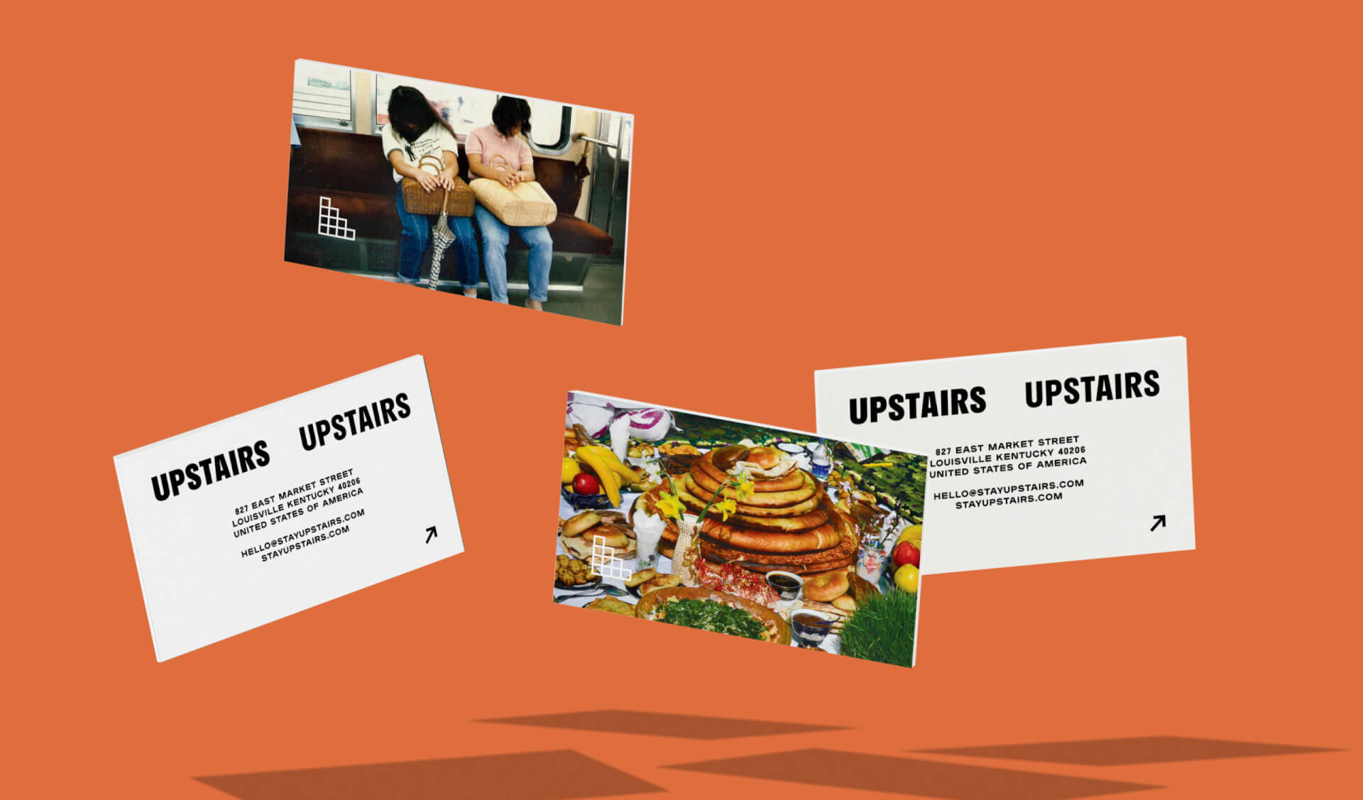
Who doesn’t love to snag customized notepads, postcards, and the like when staying away from home?

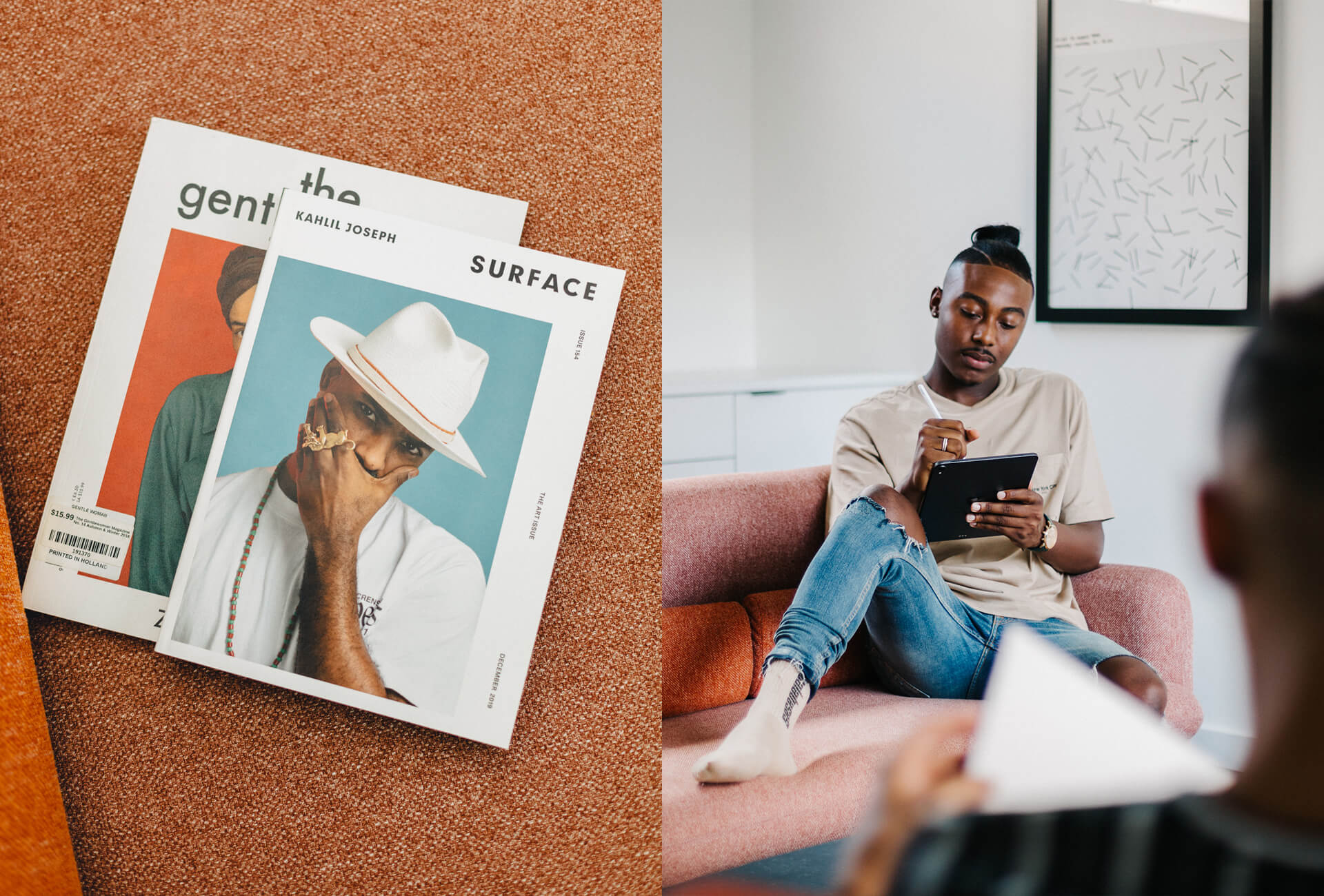
Approaching this project with the sensitivity of their travels around the globe, every ounce of available space was maximized with hidden features and amenities.

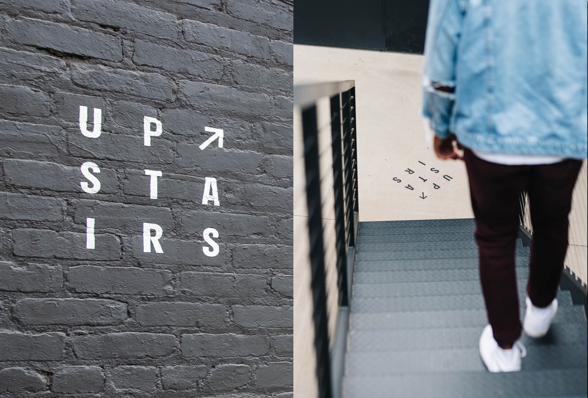
And true to their graphic design backgrounds, the Upstairs branding is unafraid of risk-taking (see the obscure found photography and minimalist type-centric treatment.) No detail was too small to consider–who doesn’t love to snag customized notepads, postcards, and the like when staying away from home? Collected design ephemera is one of the few remaining simple joys of travel in this heightened digital age, and Upstairs aims to ground the guest in that magical space long after they check out of their suites.