Great Dane
Packaging Design / Branding / Illustration / Copywriting
If you were to know anything about Great Dane Brewing Co., it should be that they are fiercely faithful in their commitment to their patrons and employees, serving as a cornerstone of the city of Madison, Wisconsin. Their presence has been lovingly cultivated over the past two decades, firmly establishing them as an institution in the community.
With a dedication like that to your hometown and the people within it, it’s easy to see how they translate that same passion and care into their own product, which ultimately makes them the type of client we love to work with. When it came time to carve out a shiny new brand direction, family of logos, brand illustration style, beer can design and merchandise, we knew it’d be an amazing challenge.
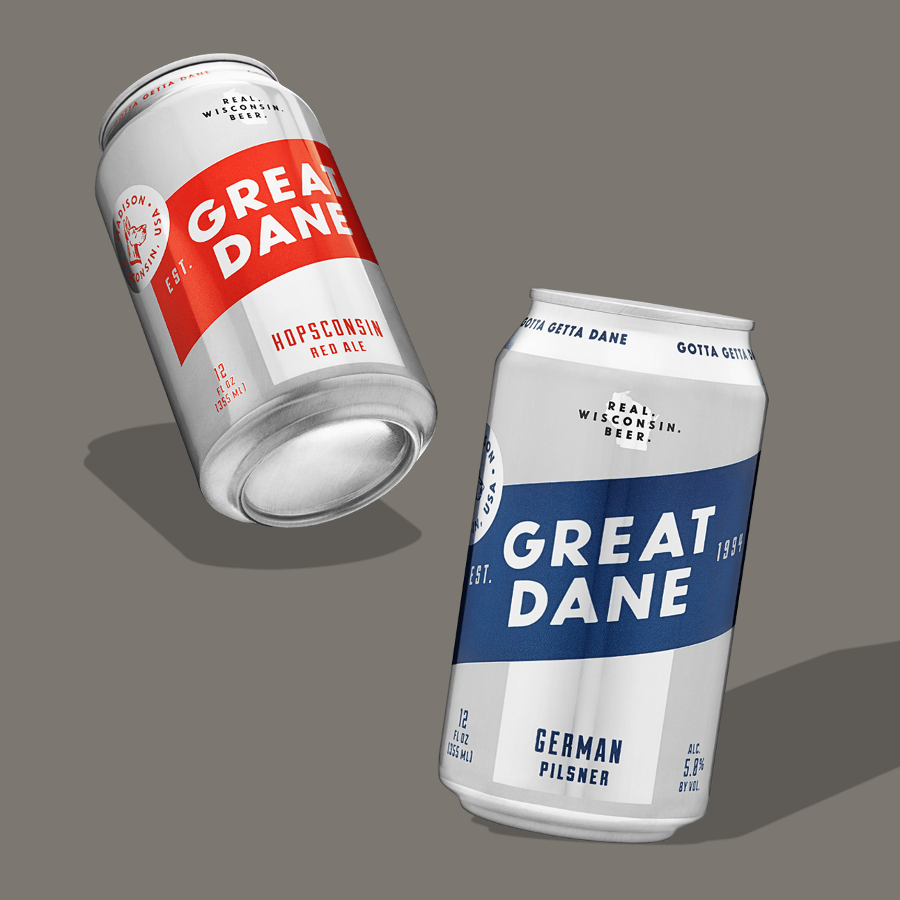
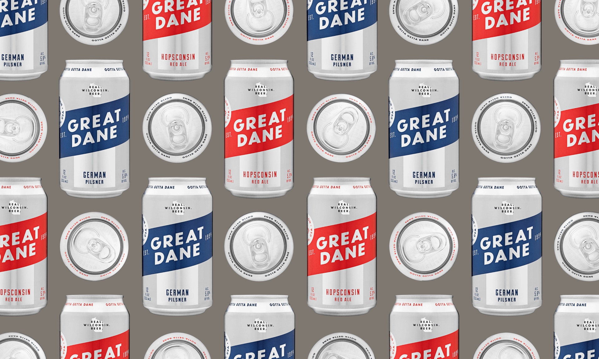
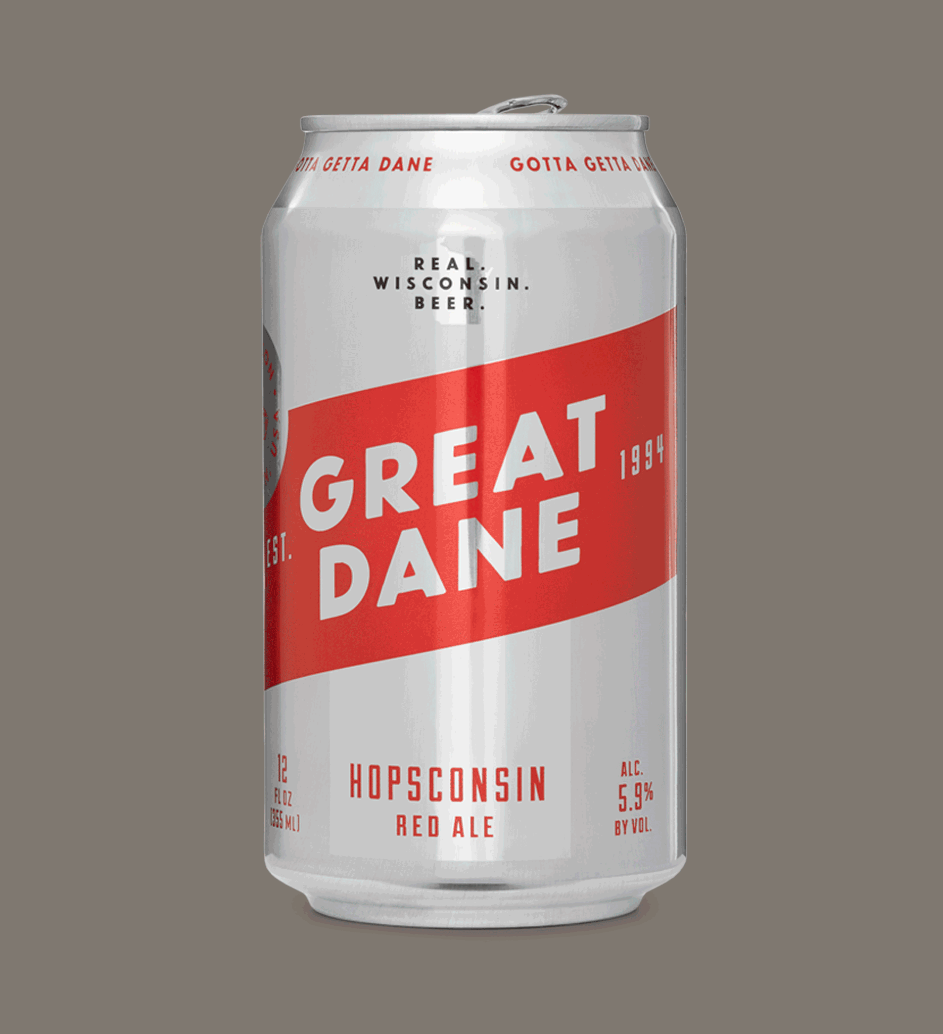
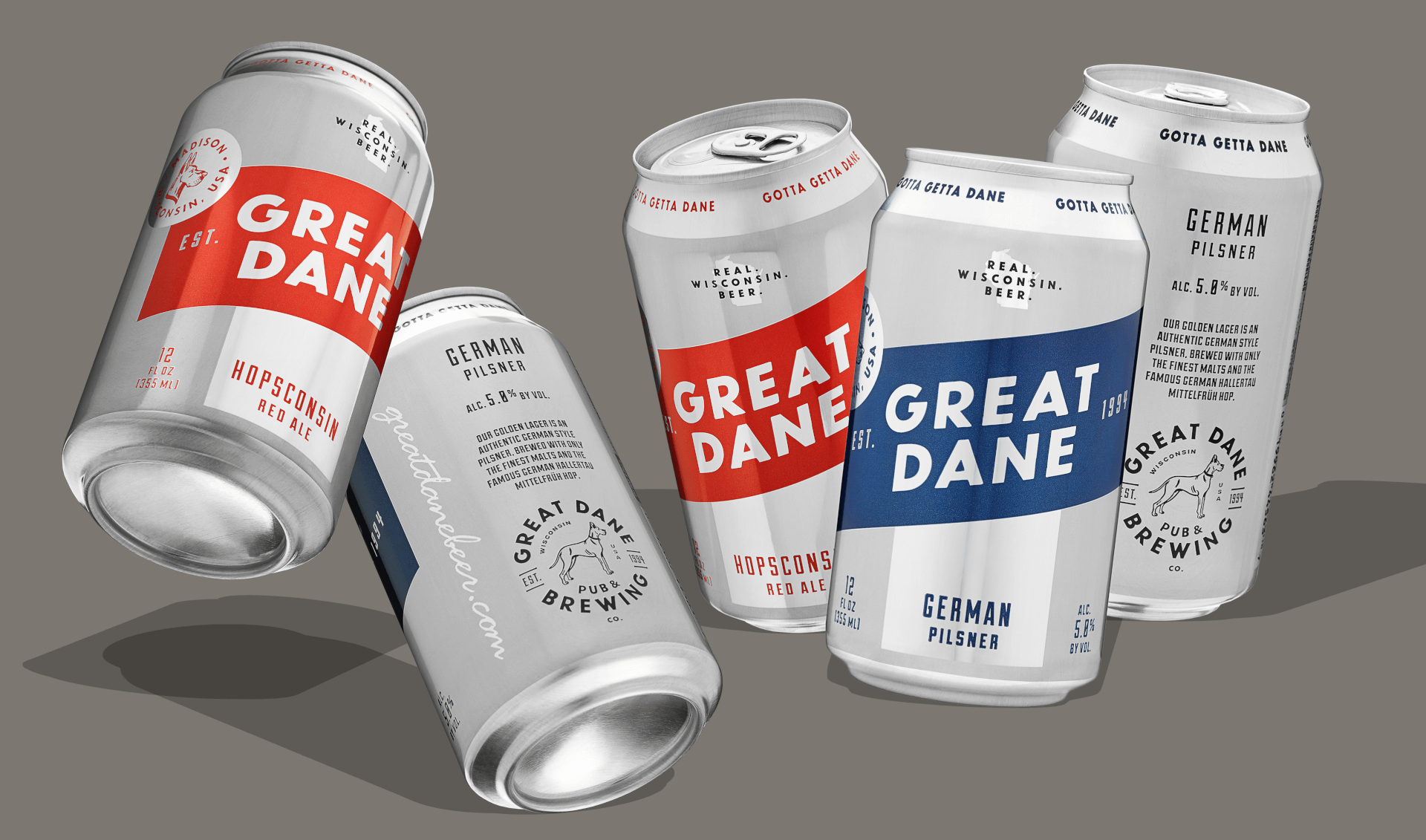
Harnessing the brand direction theme of “Modern Classic,” the design of the cans would showcase a contemporary spin on retro beers.
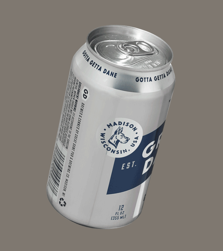
Harnessing the brand direction theme of “Modern Classic,” the design of the cans would showcase a contemporary spin on retro beers. We featured the can’s silver substrate as a “color” with a playful use of negative space and kept the palette pared down to ivory and only one additional color per beer style. Layering in nostalgic-looking typefaces came next. This was a true 360-degree overhaul for Great Dane – modernizing it for the future, while carefully respecting its past.
Counter-Print Packaging, Counter-Print, ©2018
AIGA Louisville, The SHOW Award Winner 2015
AIGA Louisville, The SHOW Judge’s Choice 2015
*Illustrations by Ryan Duggan