Phoenix Rebrand
Branding / Naming / Strategy / Creative Direction / Brand Rollout / Environmental Design / Identity System / Illustration / Digital
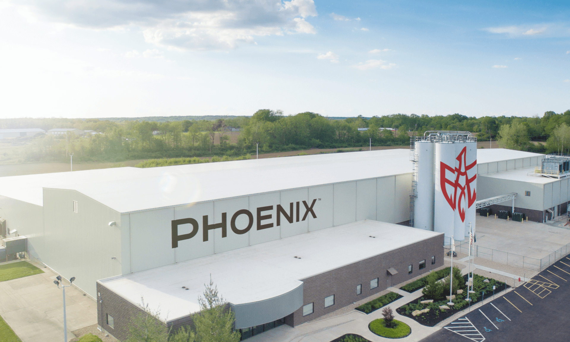
For over 100 years, Phoenix Closures operated as a family-owned company responsible for the lids and caps on most of the bottles and containers you’d find around your house. In need of a complete brand revamp that would represent their future aspirations for the company, they started with a slight name change and needed a new look to match.

As a family-owned cap manufacturer and a leader in its industry, we wanted to respect the legacy of the brand, while also bringing it into the 21st Century.
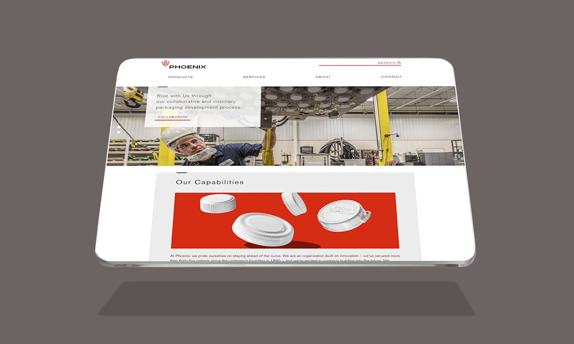
The initial directives included a new brand direction, voice and messaging as well as a new strategy, a fresh family of logos and a website relaunch. But the rebrand was soon after expanded to include product photography, marketing materials, environmental and booth design and brand standards. Throughout the expansive collection of materials, it was critical to establish and follow a consistent brand look and feel.
As a family-owned cap manufacturer and a leader in its industry, we wanted to respect the legacy of the brand, while also bringing it into the 21st Century. For the logo, a bold, modern nod to the original rising phoenix bird was carefully re-crafted to communicate power and movement, and the logotype was custom drawn to further emphasize these themes. Just as the visuals spoke volumes, the brand message clearly communicated Phoenix’s role as a collaborator in capabilities and design with their clients.
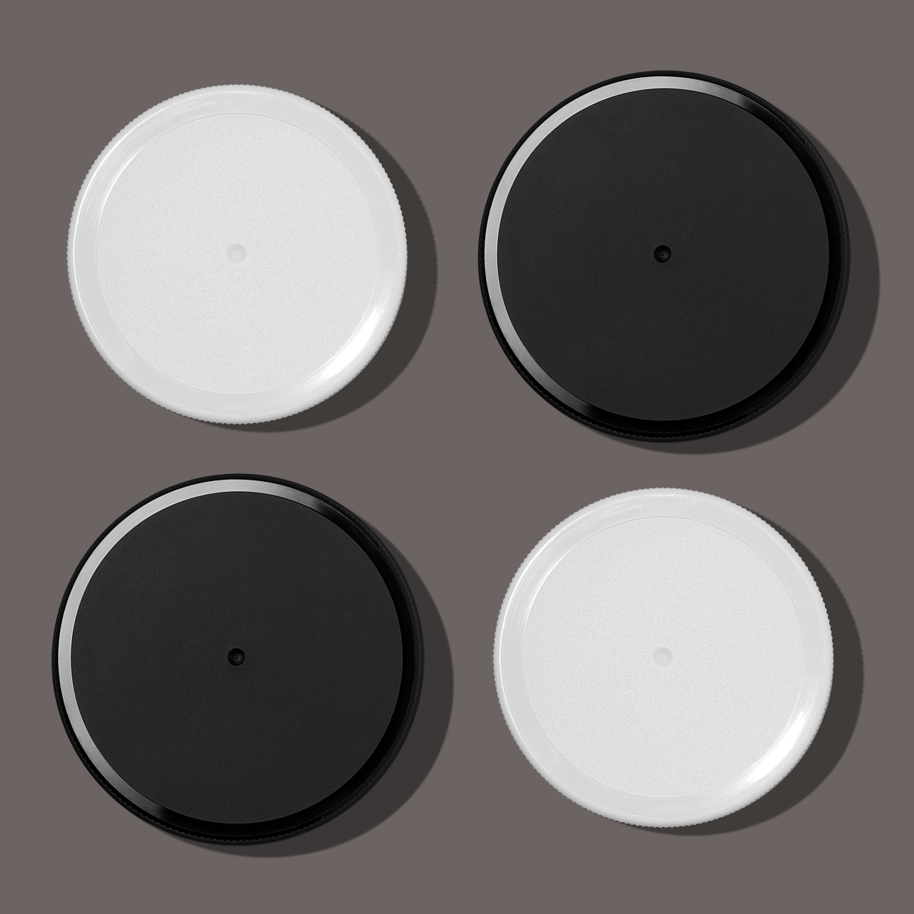
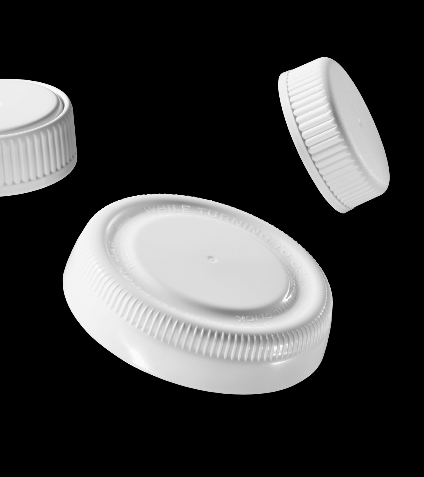
New photography was intended to make a gutsy statement by resembling nothing like any other product photography in the industry. If it made you stop and look twice, then we’ve done our job.
AIGA Louisville, The SHOW Award Winner 2017