Sound Agriculture
Branding / Naming / Strategy / Identity System / Brand Rollout / Environmental Design / Illustration / Digital / Packaging Design
When you’re talking about modifying crops to make them genetically more resilient to drought while also flood resistant, you’re talking about changing the game in agriculture. From the moment you meet the folks at Sound Agriculture, you can tell by the way they talk that big things are about to happen.

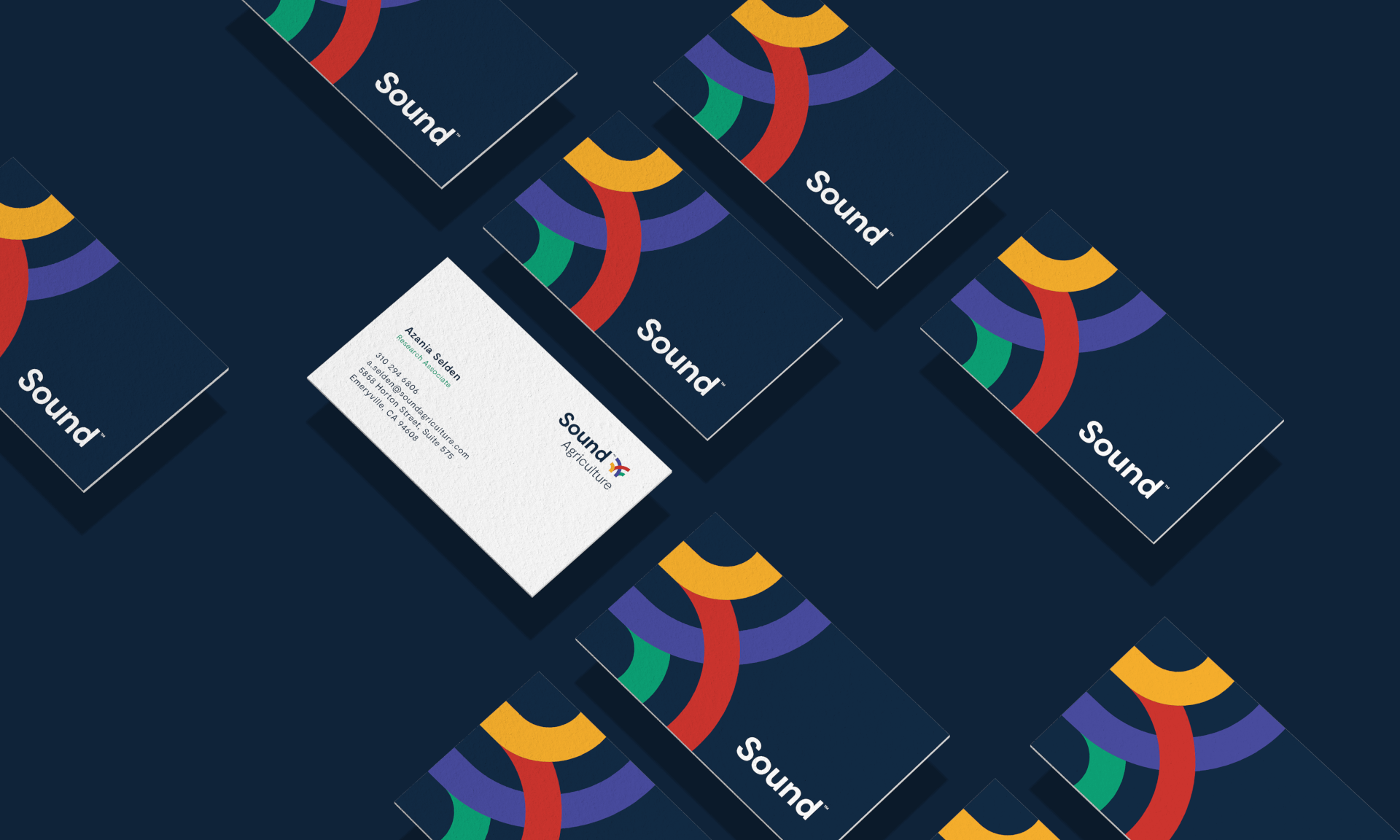
The project itself grew to take on a life of its own, starting with the brand positioning, strategy and naming. That all lead to a comprehensive full brand rollout with projects including brand voice, logo family, identity system, marketing materials, merchandise, packaging, booth displays and illustration.
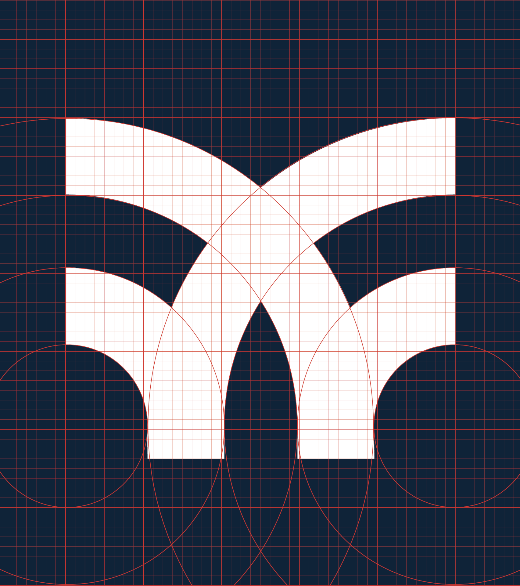
The logo was created following a grid format where a circle was sectioned into quarters, then repeatedly transposed and reflected.
The brand’s original name referred to a significant body of water but didn’t quite capture where the brand was ultimately headed. The word “Sound” carried with it a strong double meaning – relating to the proven science behind everything they do, while also giving a nod to the natural water feature. And so Sound Agriculture was born.
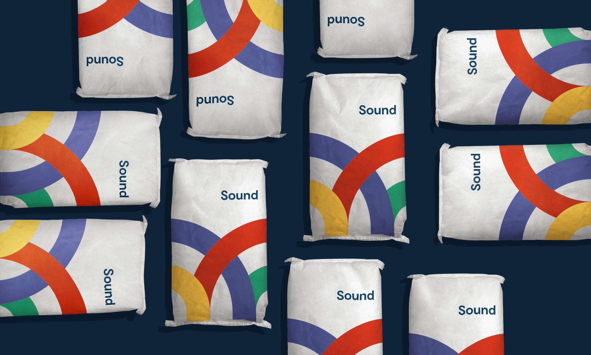
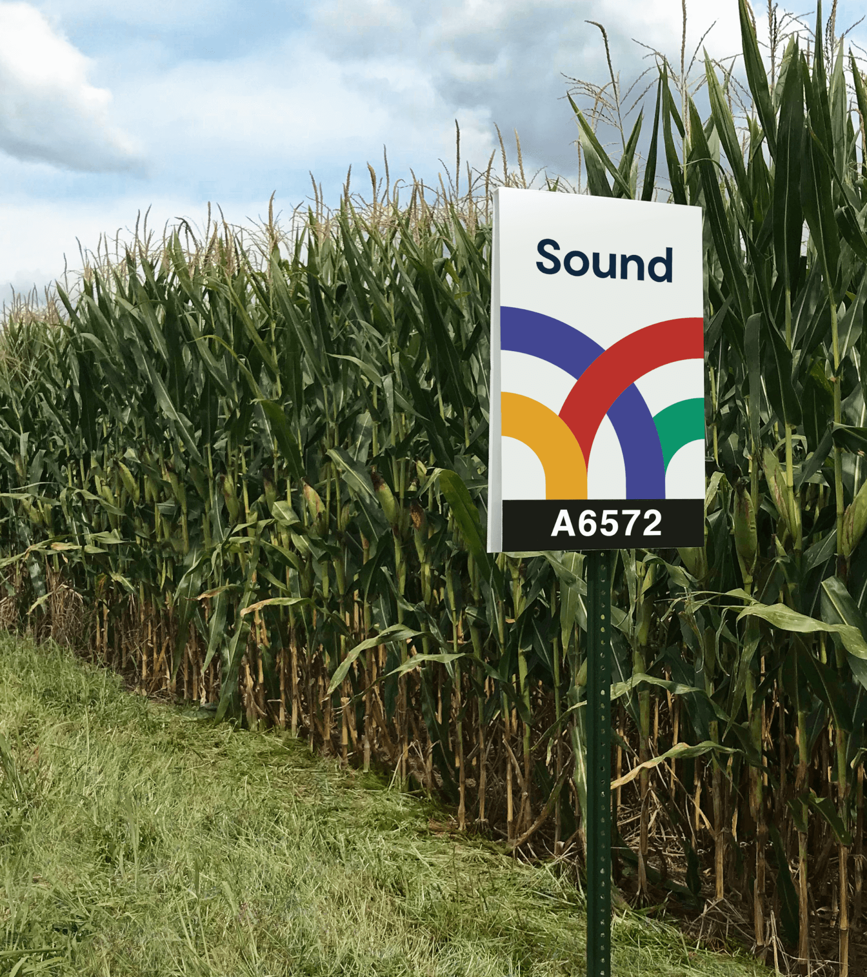
If there was ever a time to apply smart design, this was it. The brand prides itself on a DIY, intuitive approach to problem solving, so creating an approachable visual aesthetic was important. The logomark pulls inspiration from crop patterns, crop growth, and barn quilts – paying homage to the more grass-roots, personal side of agriculture and the growers themselves. It was created following a grid format where a circle was sectioned into quarters, then repeatedly transposed and reflected.
The bold palette is inspired by primary colors to communicate hope, positivity and energy. We contextualized this with a rounded, geometric sans serif that appeals to everyone – from farmer to investor to everyone in between.
AIGA Louisville, Identities/Logos, Honorable Mention 2018