Indigo Agriculture
Branding / Identity System / Brand Rollout
For this project, we were approached by One Design Company to collaborate with them on creating the branding, identity system and brand rollout for Indigo Agriculture, a new brand with a radical vision.
Getting the opportunity to design a startup biotech company with their sights squarely focused on changing the landscape of big agriculture was one of those rare opportunities we’ve been searching for.
A company that carefully considers the Earth’s natural microbiomes, Indigo developed a revolutionary protocol to sustainably grow and harvest crops. Indigo’s goal for its messaging, therefore, was to position them in a manner that highlighted the company’s commitment to caring for the planet while still paying respect to the science and industry behind the brand.
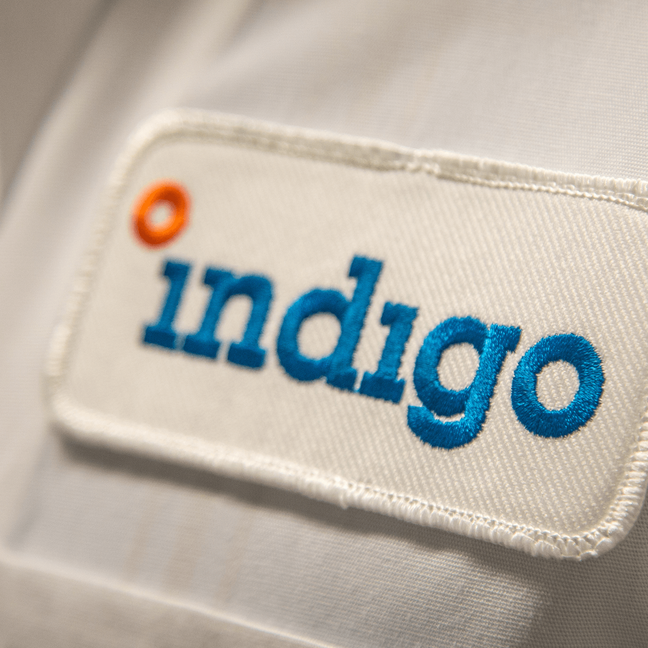
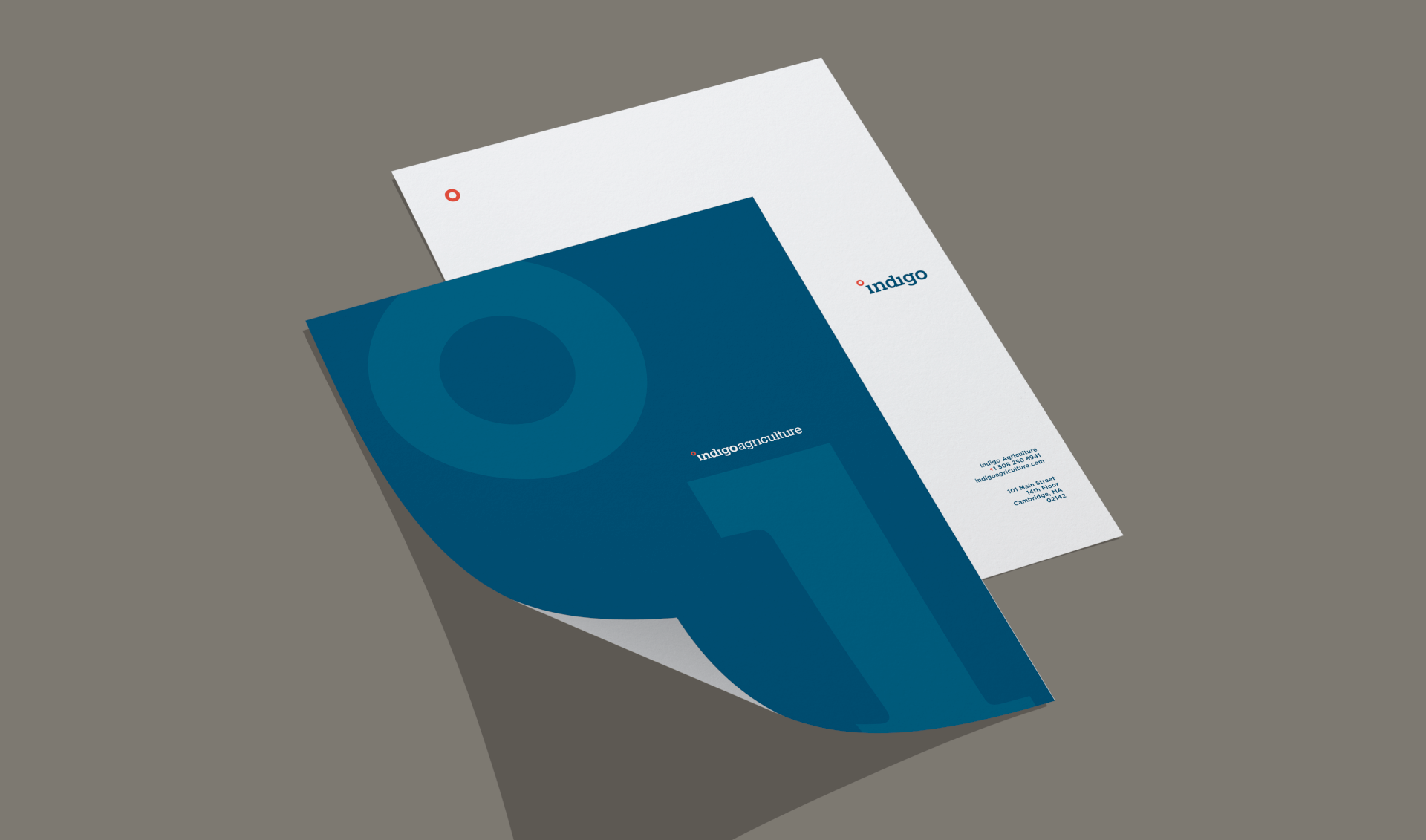
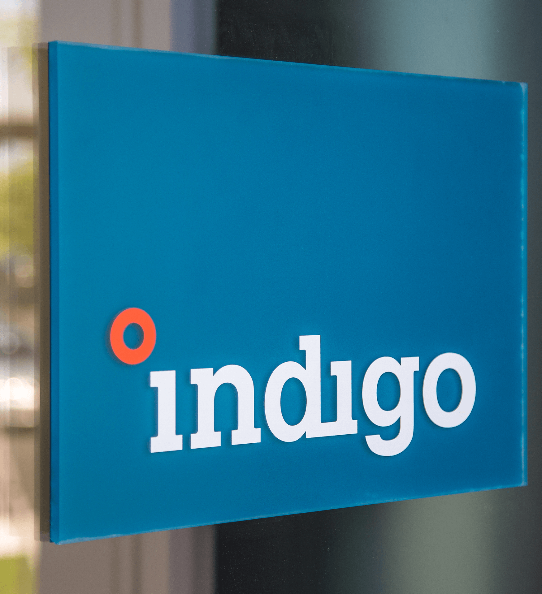
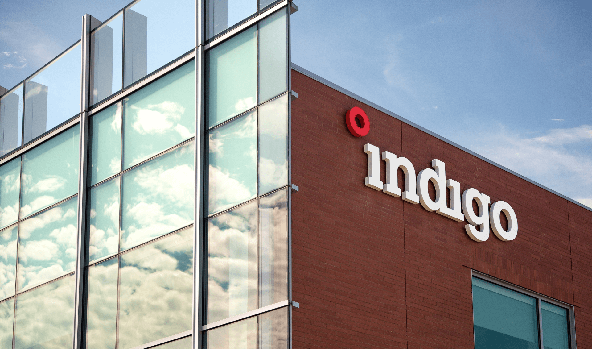
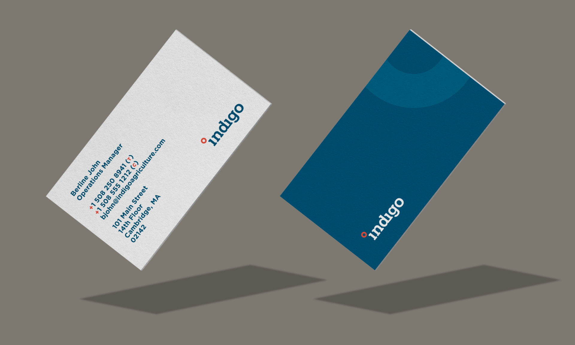
The logo was designed with an approachability in mind, but one that steered clear of the overtly tree-hugger tone many environmentally conscientious brands employ.
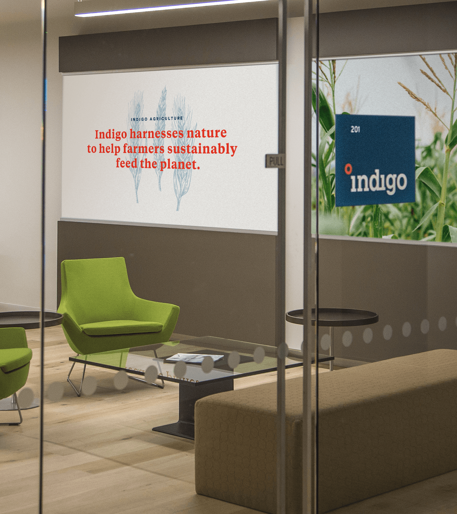
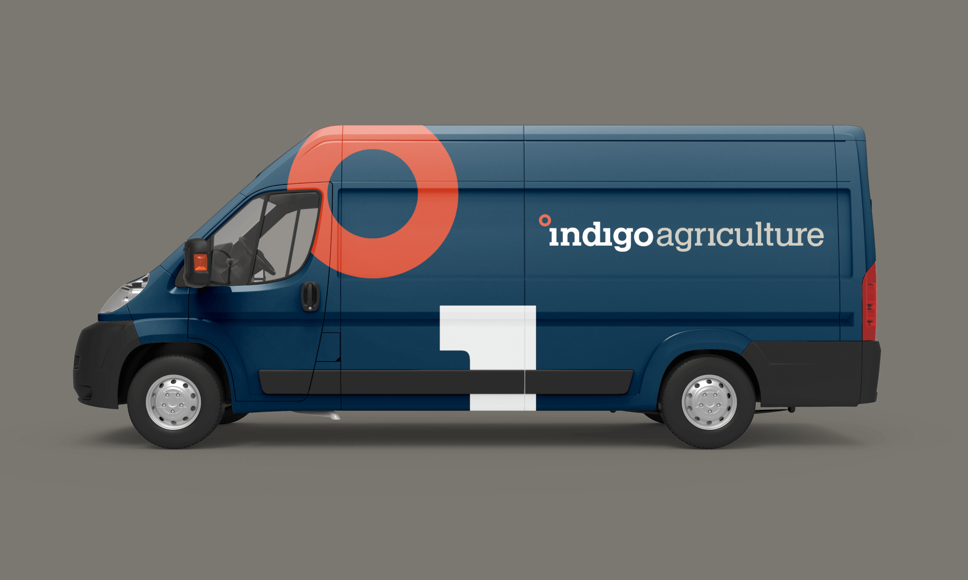
The logo was designed with an approachability in mind, but one that steered clear of the overtly tree-hugger tone many environmentally conscientious brands employ. We customized letterforms that straddled the line between earthiness and tech and chose colors that stood out in the landscape of agricultural brands with their unexpected, vibrant hues. Rolling out the identity across Indigo’s stationery, wearables and other various environments, it felt like a natural next step to play into the bold aesthetic with large-scale design elements and vast, saturated areas of color. The result is a thoughtfully-branded system of which we were proud to be a part.
PRINT, PRINT Regional Design Annual 2017
AIGA Louisville, The SHOW Award Winner 2016
*Creative Direction: One Design Company