Rockwell Bottle Shop & Coffee
Branding, Creative Direction, Typography, Copywriting, Signage, Custom-Lettering
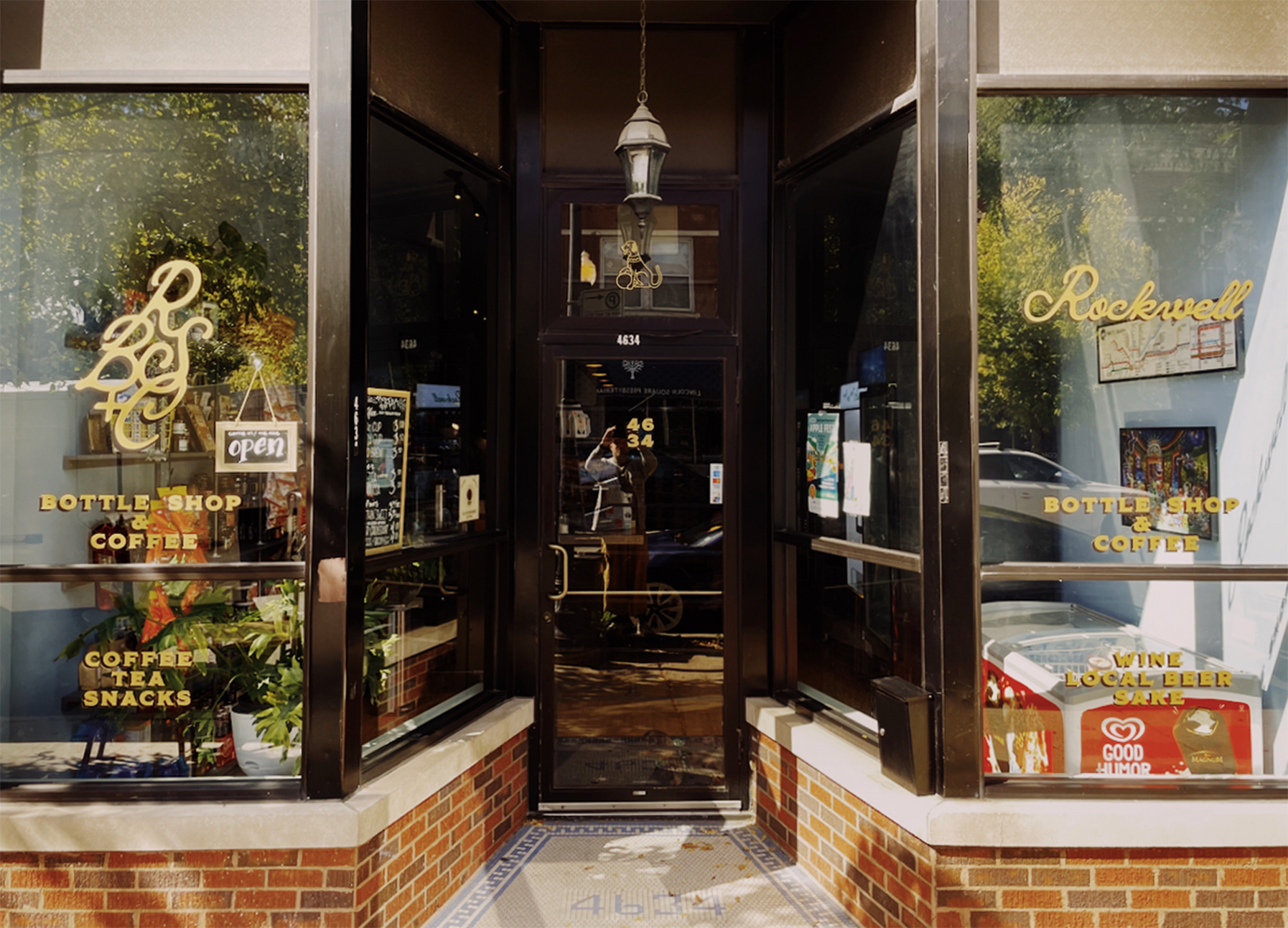
You know that place where you can get a fine cup of coffee, a snack, and a killer bottle of wine all in one spot? That’s Rockwell Bottle Shop & Coffee. RBS&C stands proudly as a quaint storefront in the Lincoln Square neighborhood of Chicago. Lincoln Square is one of the more picturesque areas of the city where the ‘L’ train runs at street level, and many businesses are still locally owned and operated. It’s a little quieter, a little slower.
When proprietor Ty Fujimura approached us to work on the project, he described the shop as a neighborhood hub. A place to grab a jolt of caffeine or a breakfast sando, for sure, but also a place to sit and unwind with a cold one from their thoughtfully stocked cooler or snag a perfect party favor before jumping on the train.
Elements of the Fujimura family history pop up in the panting dog illustration above the shop door. It’s a nod to his mother’s family crest and serves as a mascot for the shop.

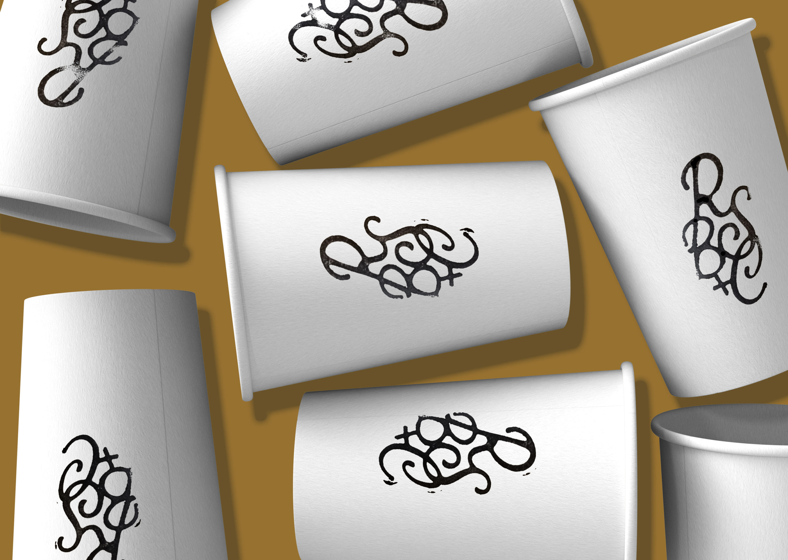
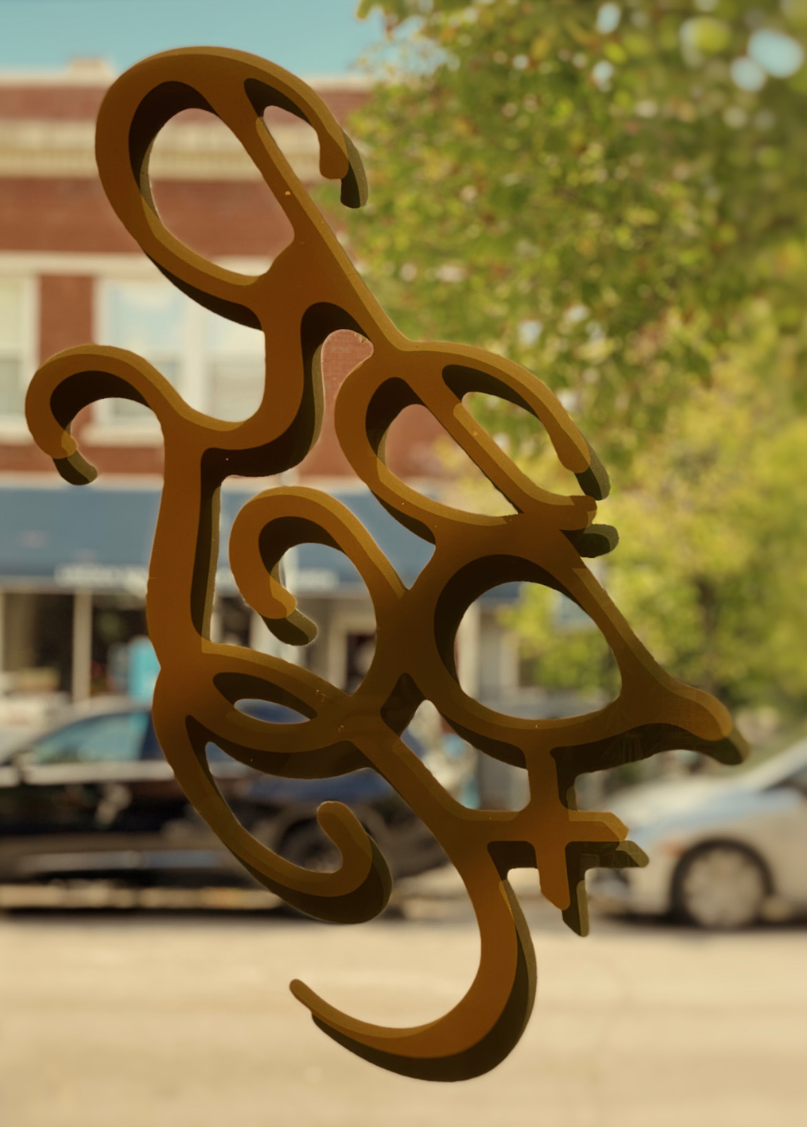
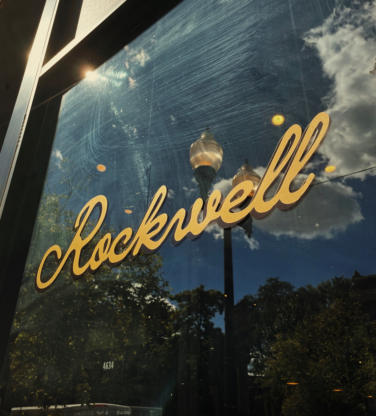
With the branding system, we set out to capture Ty’s vision of a bodega-as-community meeting space by centering this welcoming spirit in all of our visual explorations. Vintage-inspired script logos and gilded window signage greet guests as they make their way to the whimsical “Well, Well, Well” taglines marking the shop’s coolers. Elements of the Fujimura family history pop up in the panting dog illustration above the shop door. It’s a nod to his mother’s family crest and serves as a mascot for the shop. (Side note, a real-life wiener dog sometimes works the register, so be on the lookout.)
Vintage-inspired script logos and gilded window signage greet guests as they make their way to the whimsical “Well, Well, Well” taglines marking the shop’s coolers.
This very originality is the hallmark of all of Fujimura’s endeavors—the unmistakable mixture of peak hospitality, quality foods and wares, and cheery goofiness that allows guests to feel right at home. So, drop by and say hello next time you’re up that way. You’ll leave with your wallet a little lighter and a bag full of the good stuff.
RBS&C stands proudly as a quaint storefront in the Lincoln Square neighborhood of Chicago.